FLUOR
An eclectic pop venue’s color-packed web design
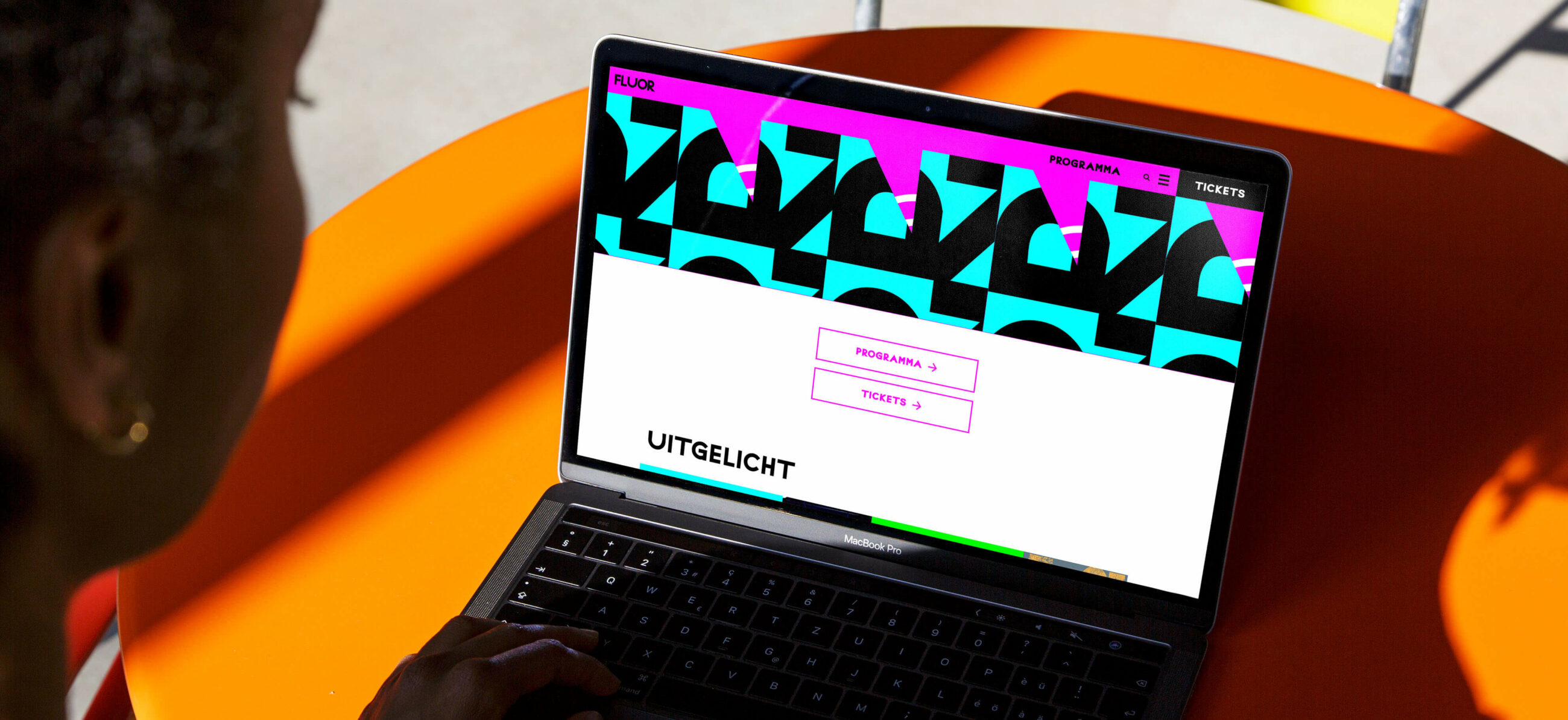
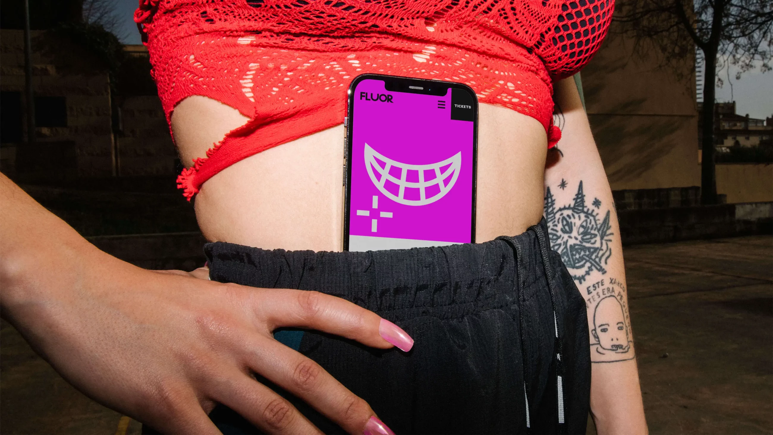
As a music venue, FLUOR combines hosting our favorite bands and musical artists with exceptionally expressive branding. From the iconic smile logo to the popping color theme, FLUOR is not afraid to show some skin. For their new website, we partnered up and were given the freedom to explore every sharp corner of this funky identity, all the while keeping a steady focus on a solid user experience.
FLUOR already had expressive branding elements, but no website that had those elements incorporated into good design. We focused on better functionality and better user experience, without losing any of the expressive personality. The result is a much more representative website that has improved their user engagement and upped their ticket sales.
The value we added
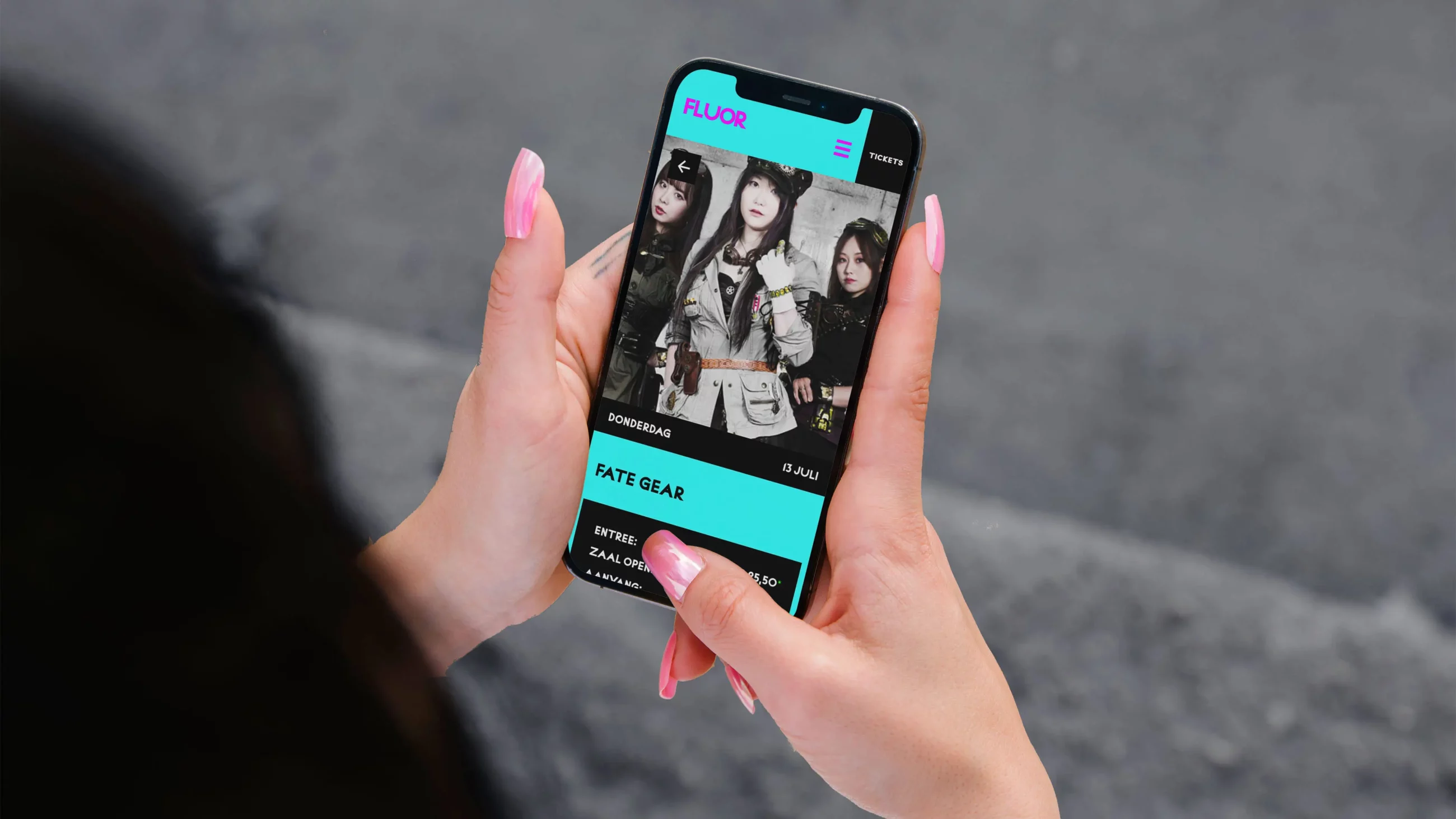
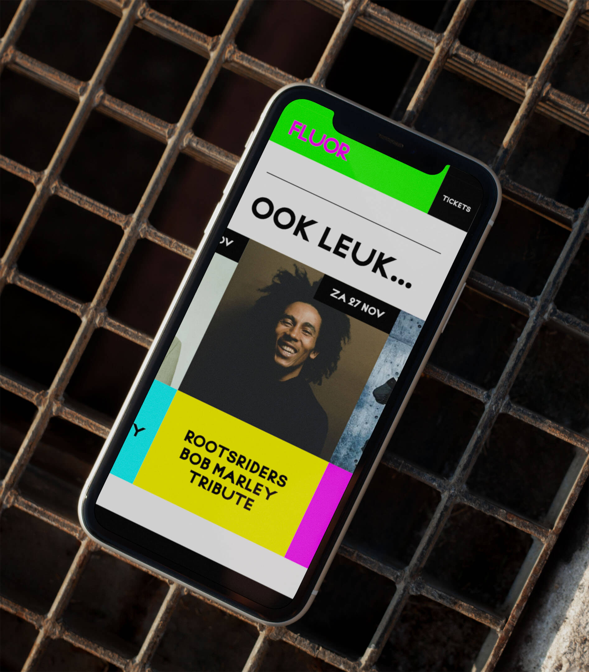
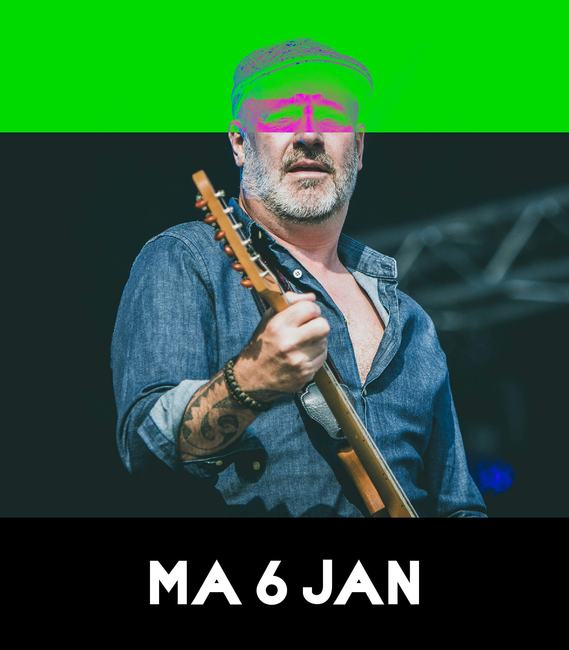
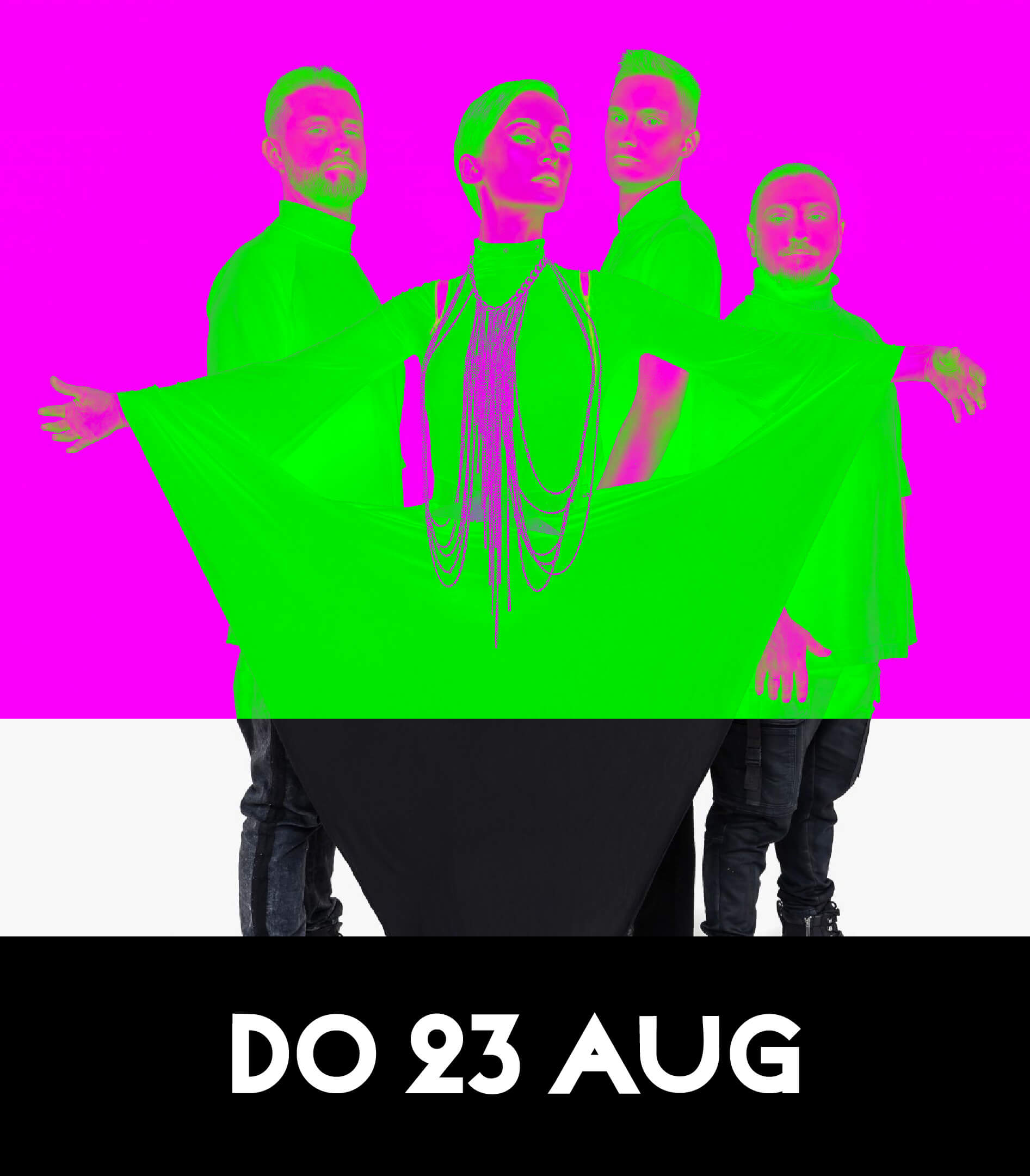
Strategy — To do fluor as a visual concept justice, we needed a way to incorporate it into the user interface. So a smart use of the blending modes in current web browsers transforms one fluor tone into another. For a clear and legible agenda and ticket module, black boxes and bold lettering were used on white deliberately to create heavy contrast.
Where once a toothpaste factory stood
Design — While the fluor colors speak for themselves, we made sure to have them scream - with slight overdosing. The big, bold, sharp elements and lettering were pushed to the limit as a constant reminder of FLUOR's rough edges. Variable graphic animation translates the eclectic lineup of FLUOR into a resonating visual experience.
Photography by: Dennis Wiegel and Faizel Joemrati
Photography: Dennis Wiegel and Faizel Joemrati
Webdevelopment: Buitengewoon Concept
Studio Kartel designed and developed our website. Clear communication, and a studio that is engaged in the process in a very supportive way!
- Rik Veldhuizen
- Head of Marketing & Communication of FLUOR
Feel persuaded? Get in touch