Here, we are
A QFFU cinema campaign that amplifies queer presence
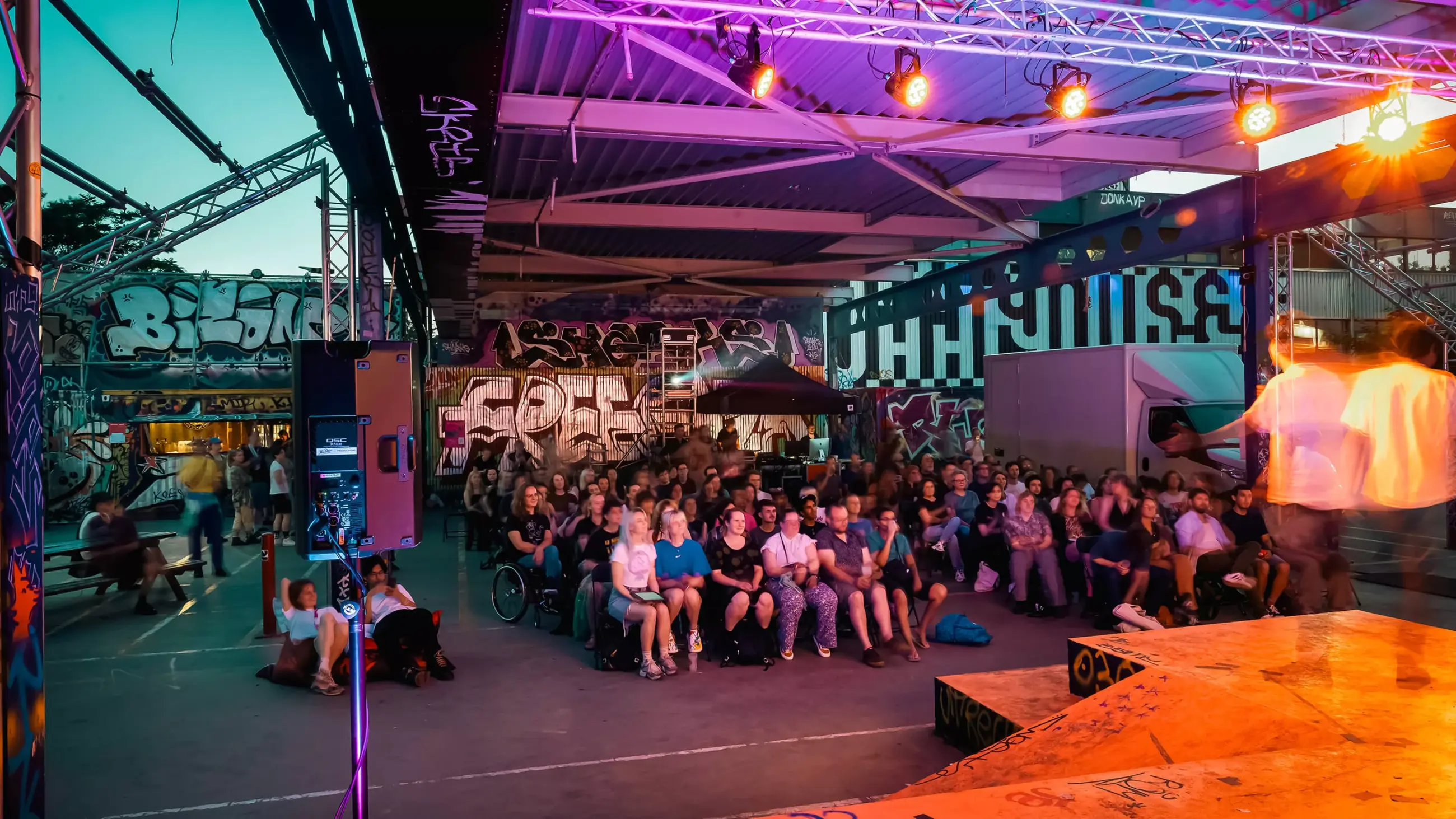
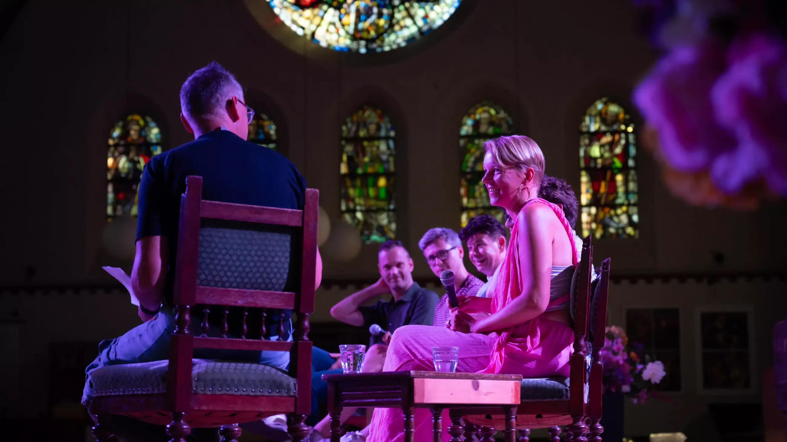
On a mission to create a dignified, week-long space for the unique film stories of Queer Film Festival Utrecht, we designed a campaign that positively affirms the here and now of queer identity. These cinematic narratives require no further explanation beyond themselves. Instead of having to repeatedly answer to outdated norms and values — over and over, again and again — QFFU’s cinema repertoire breaks out into the public sphere with accelerating conviction.
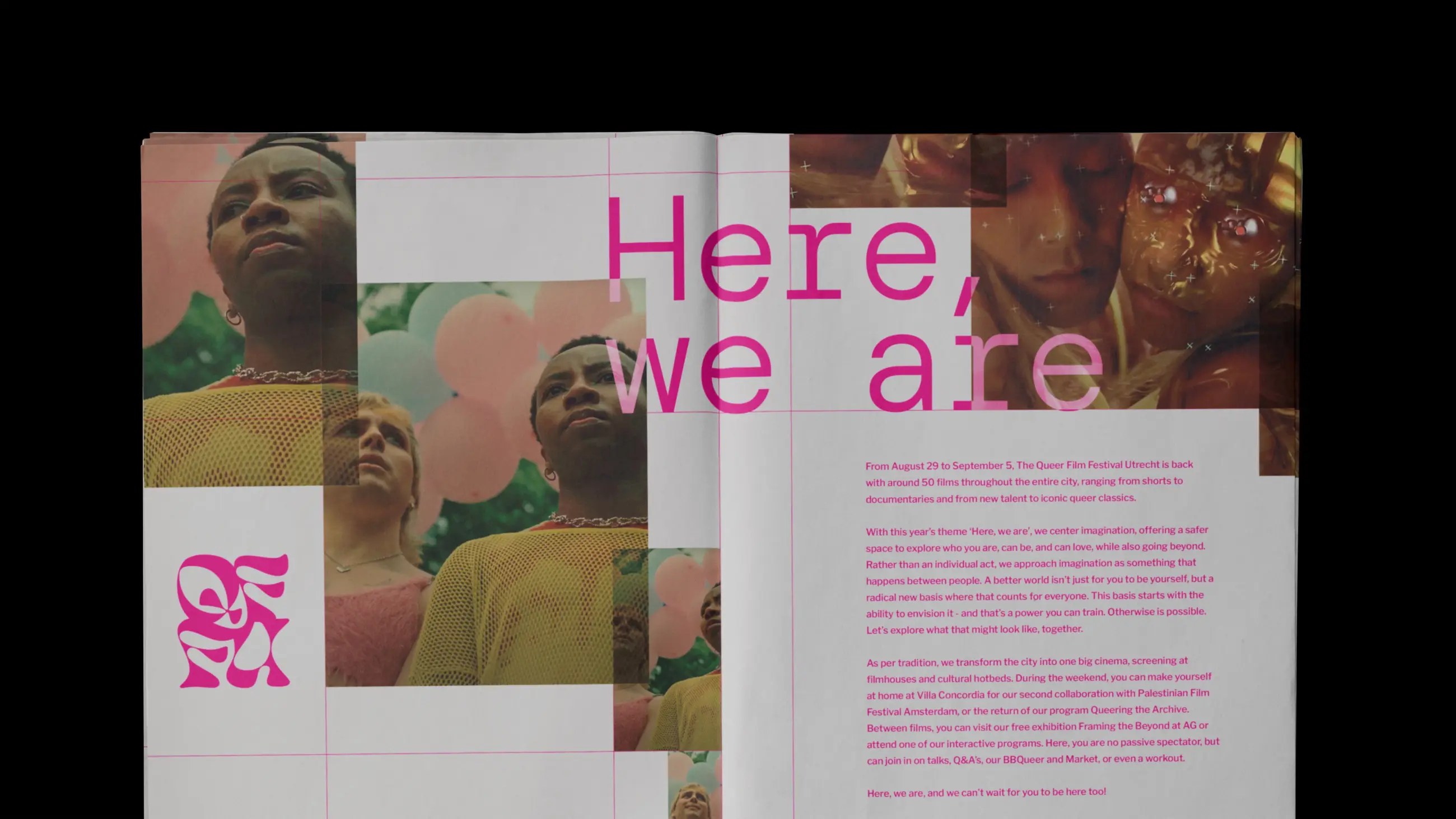
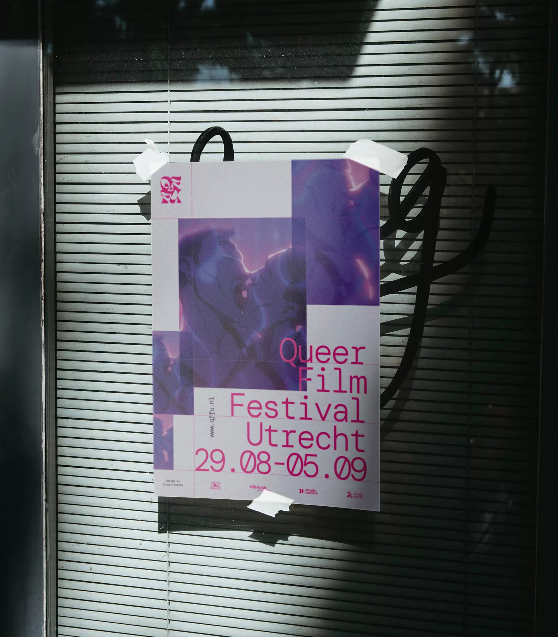
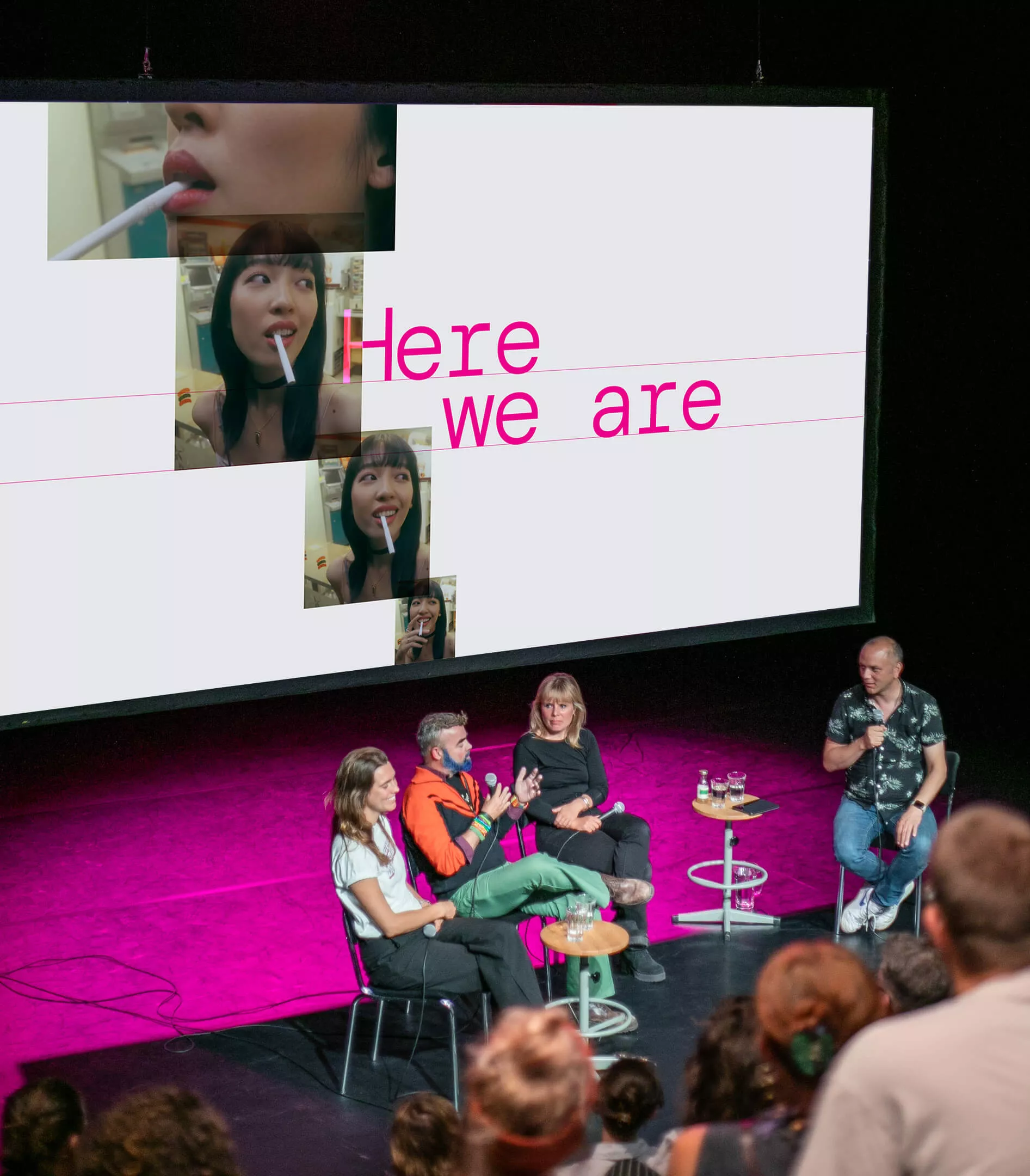
Every year, QFFU bases its programming on a unique theme that captures the cultural mood of the moment. With Here, we are, we helped amplify a message of idiosyncratic presence. Every queer story is worth telling. Every identity is thrilling in itself. By reinforcing this positive momentum through a series of frames that shift and connect, the campaign’s design helped fuel viewers’ anticipation, enabling the festival to sell out many of its film screenings.
The value we added

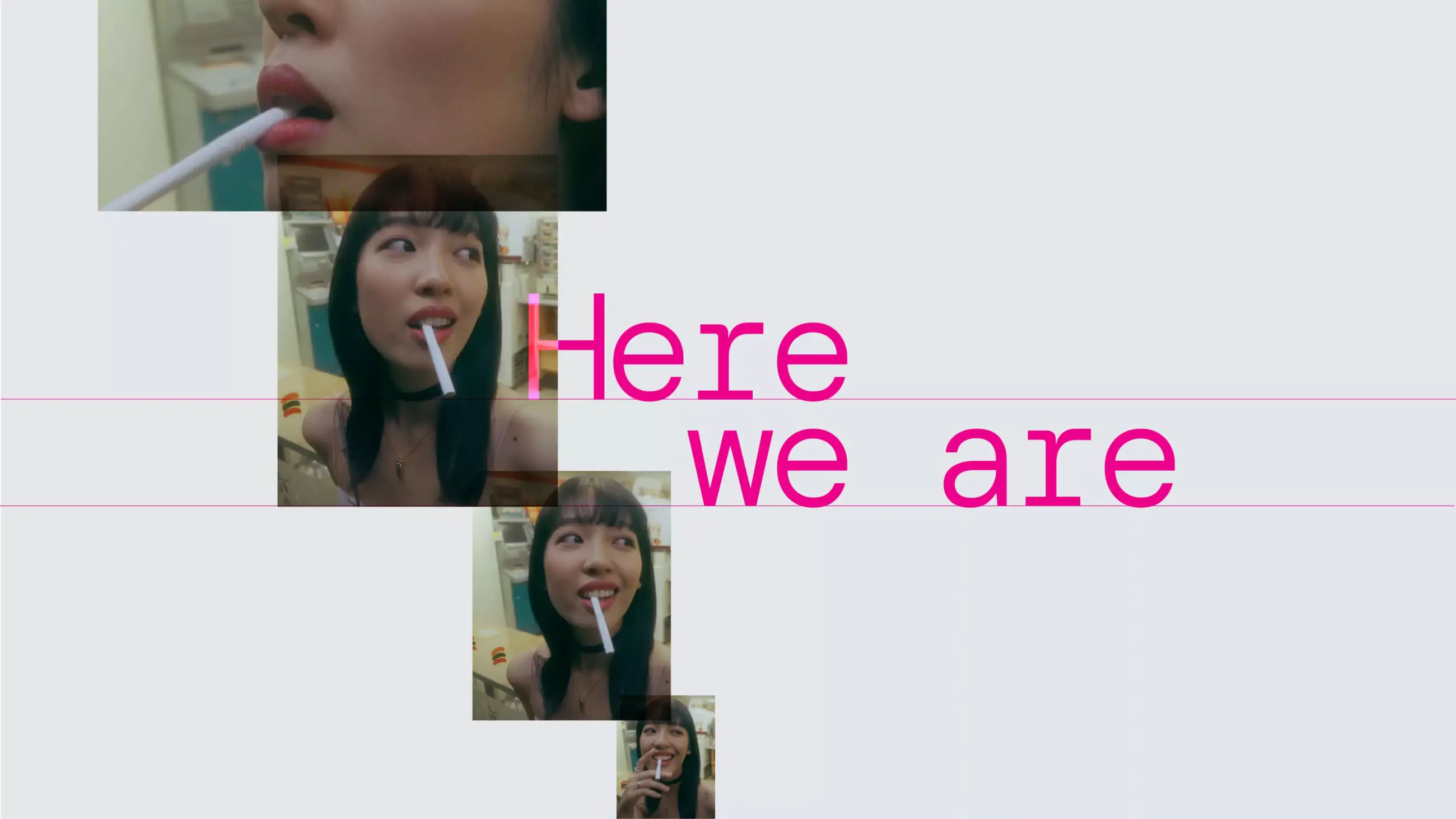
Over and over. Again and again.
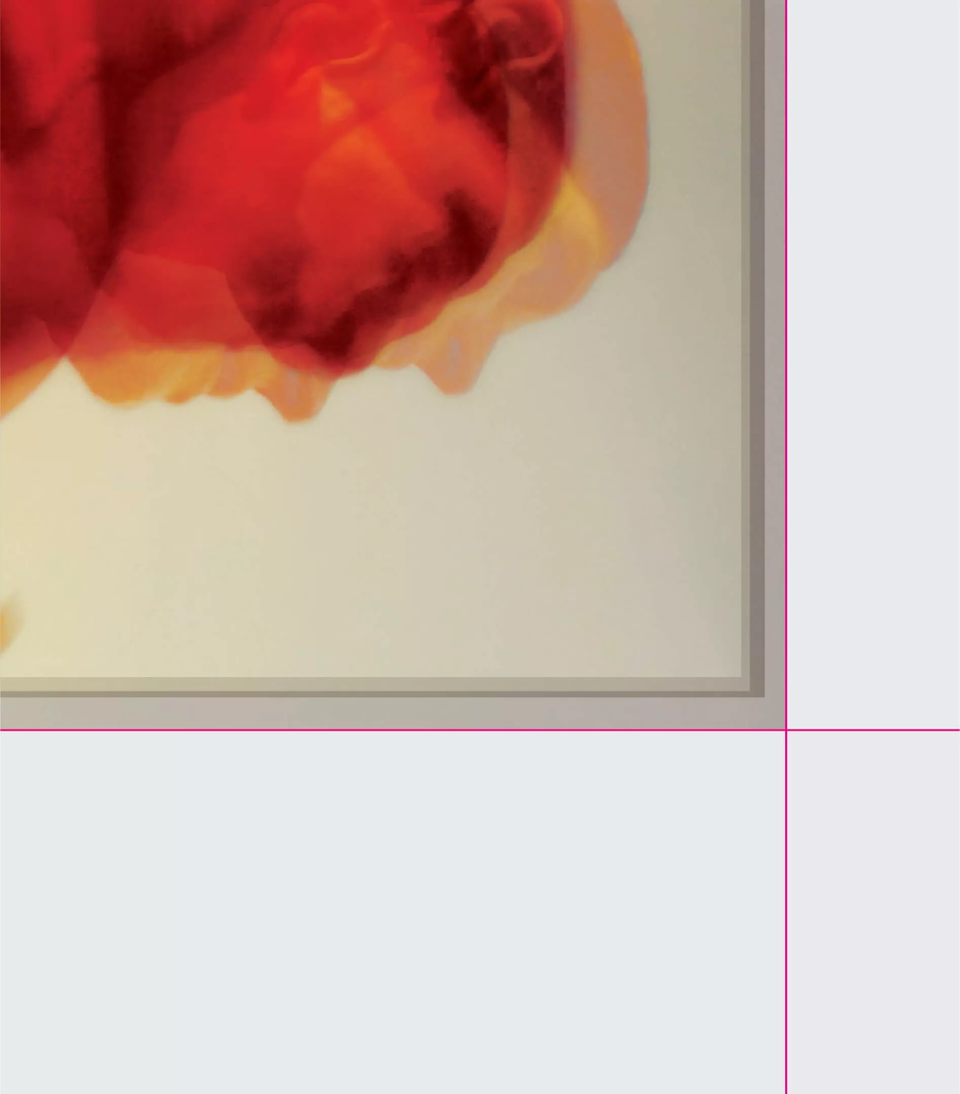
The design — Wanting to emphasize the power of reiteration, we looked for design elements with an affirmative, amplifying, and repetitive quality. By setting the visual concept against a blank white canvas (light grey in QFFU’s case), we made room for blow-up compositions of the film frames to convey positive momentum. Additionally, the close-up scenes of the characters help evoke the cinematic drama of relatable personal transformations.
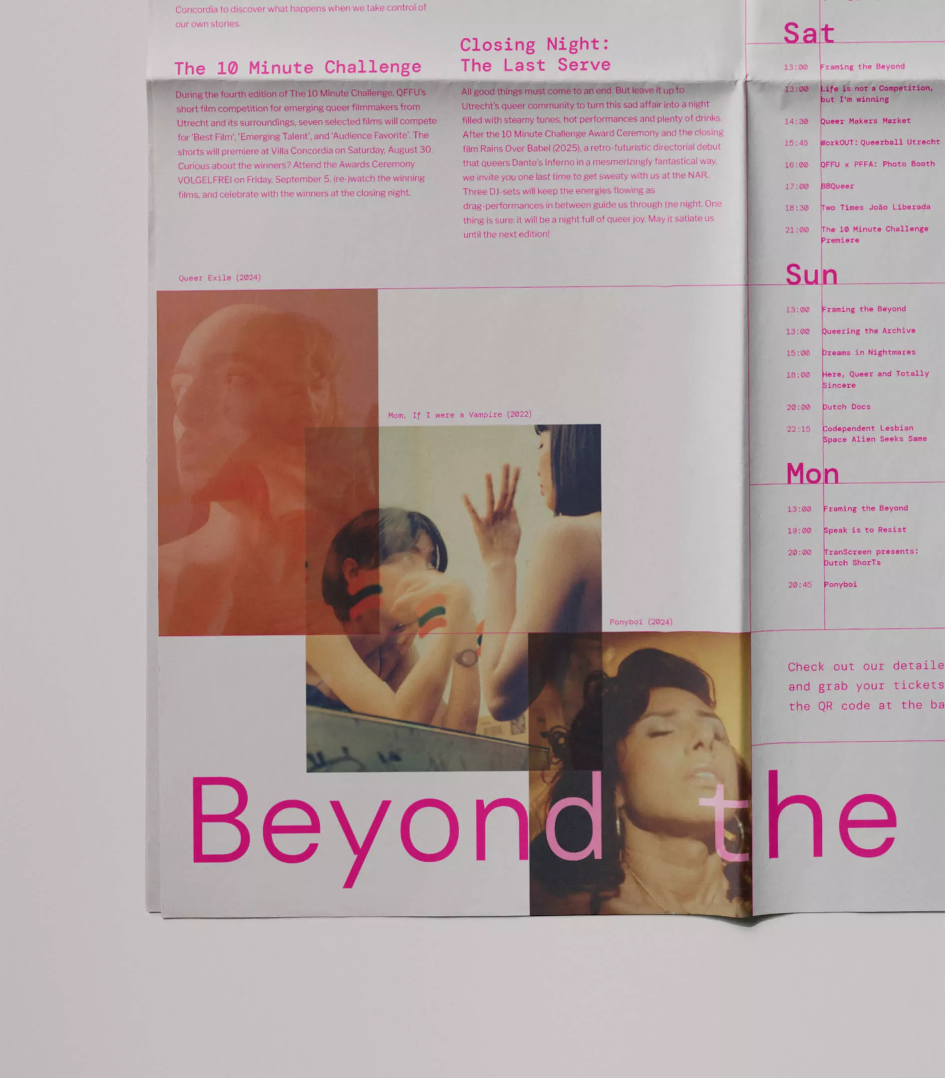
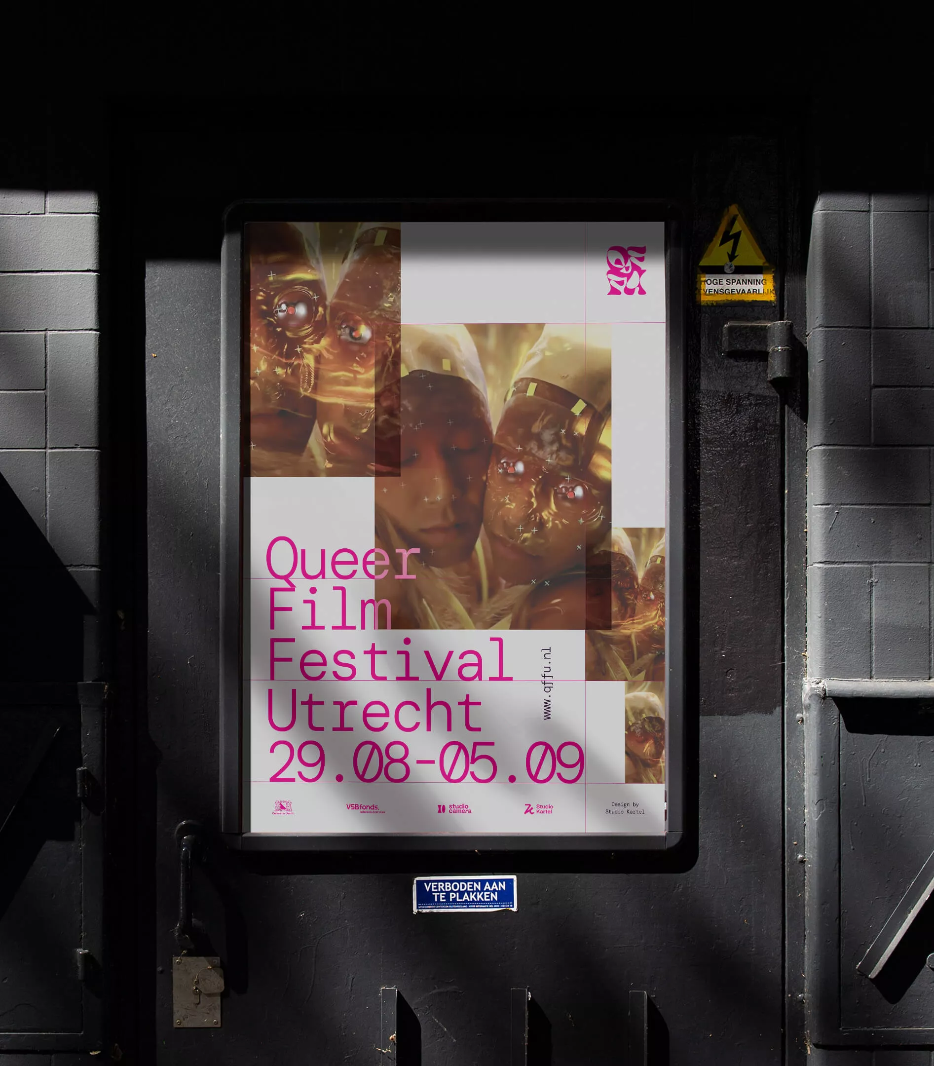
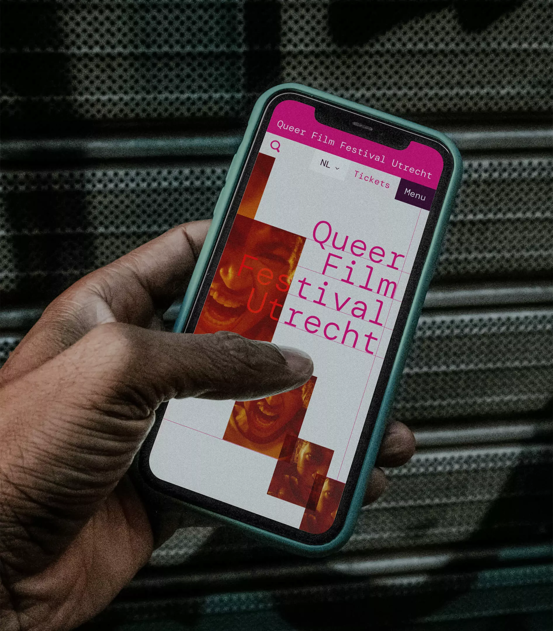
The strategy — As the campaign design is a specific part of the broader QFFU identity, we had to work within the bounds of QFFU’s visual identity. The challenge was to use the fonts, colours, and imagery typical of QFFU in a novel way. The use of these elements differs considerably from that of earlier campaigns. Magenta is now used as a highlight rather than a main colour. By layering video footage, we also reinterpreted the brand’s slogan, ‘beyond the frame’, in a new way.
A professional, tasteful, and creative company. Amazing work with branding!
- Regina Csóti
- Head of Marketing and Communications of QFFU
Feel persuaded? Get in touch
