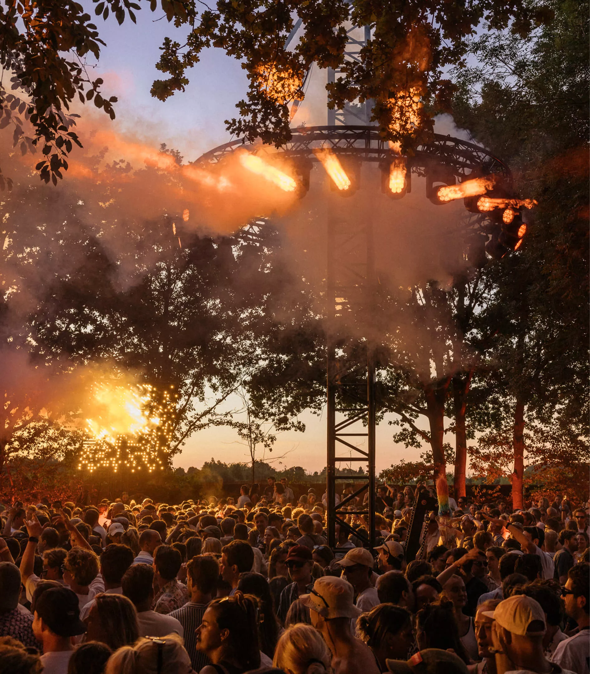
Lago Lago Edizione 04
Summer luxury nostalgia
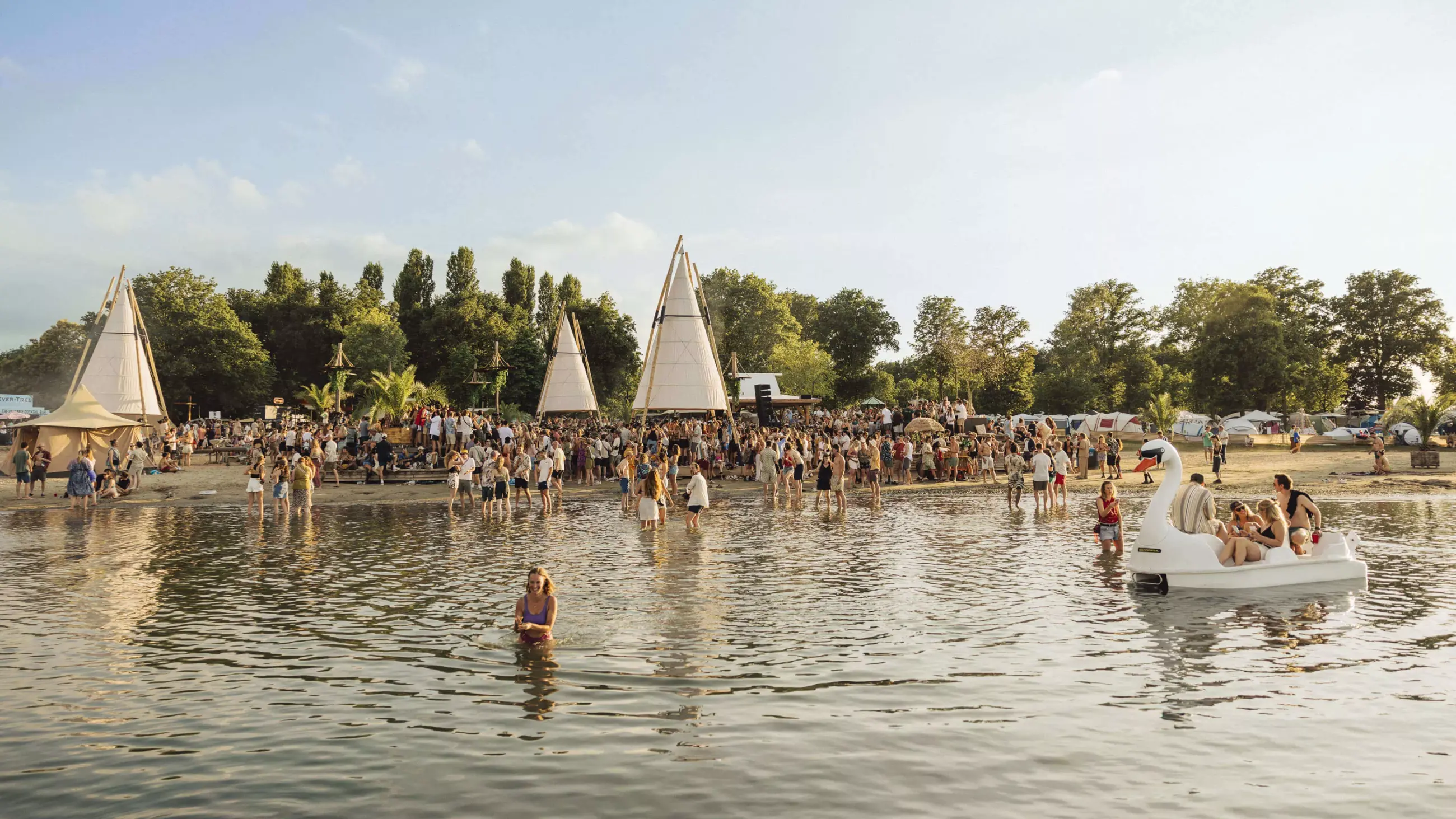
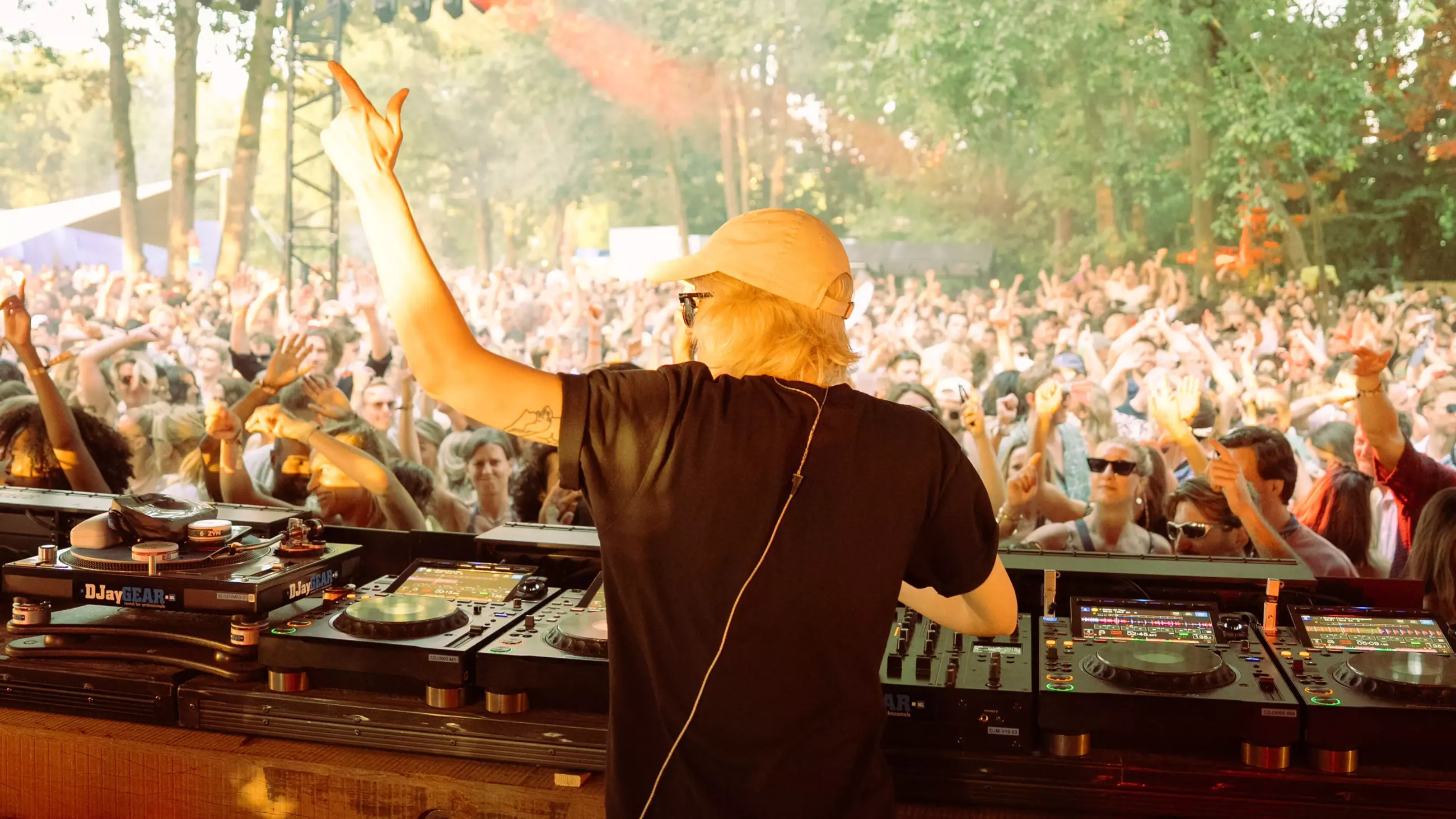
With its retro Italian beach campaign, the fourth edition of Lago Lago pushed the boundary of festival vacation even further. With little left to proof, the festival had plenty room for much extra. For the fourth time in a row, we were asked to reinvent the complete Lago Lago visual identity and squeeze even more style from its glorious essence.
With a few years in, we were now able to tailor the identity to fit the needs of a narrowed-down target audience. The campaign design could therefore really claim a niche of its own, to position itself resiliently in a crowded field. By drawing inspiration form the festival’s soul, not from competition, we were able to stay away from trends and create a unique tone of voice. The identity has become more pronounced, and the brand has become widely renowned.
The value we added
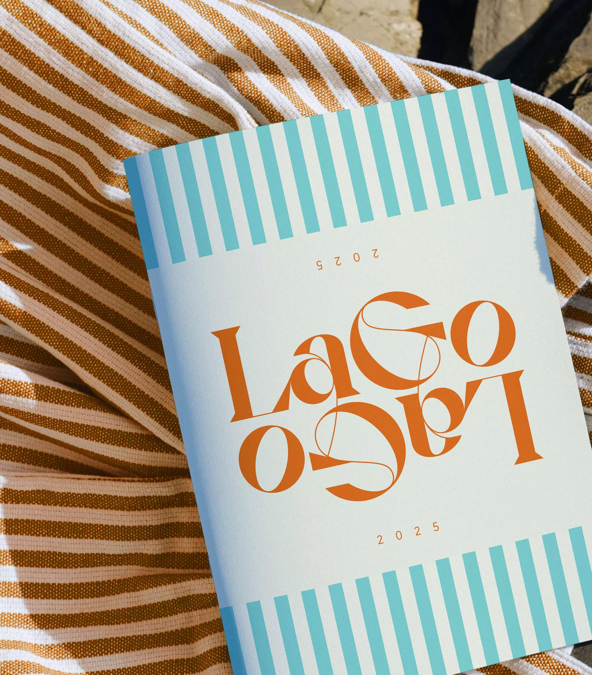
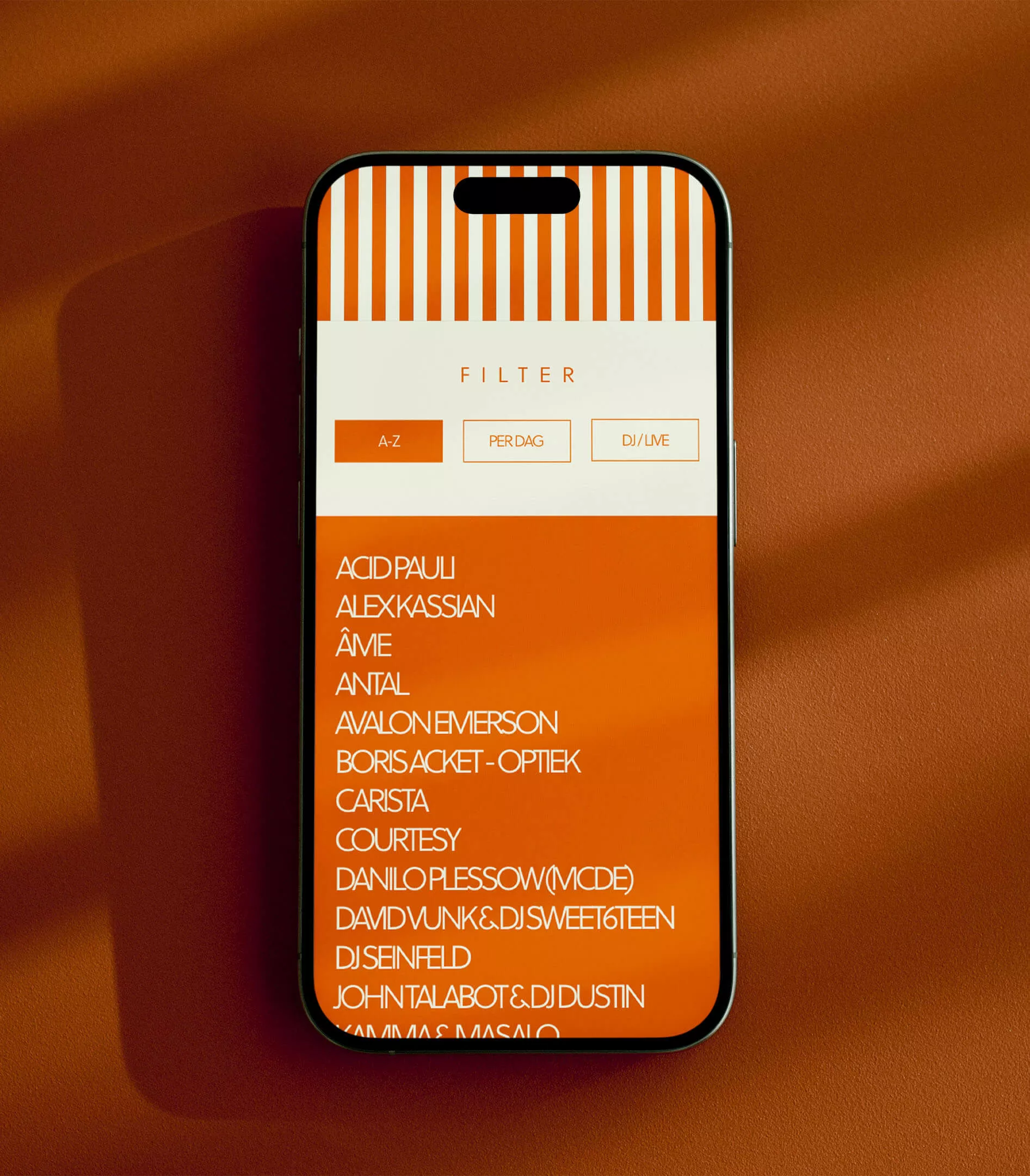
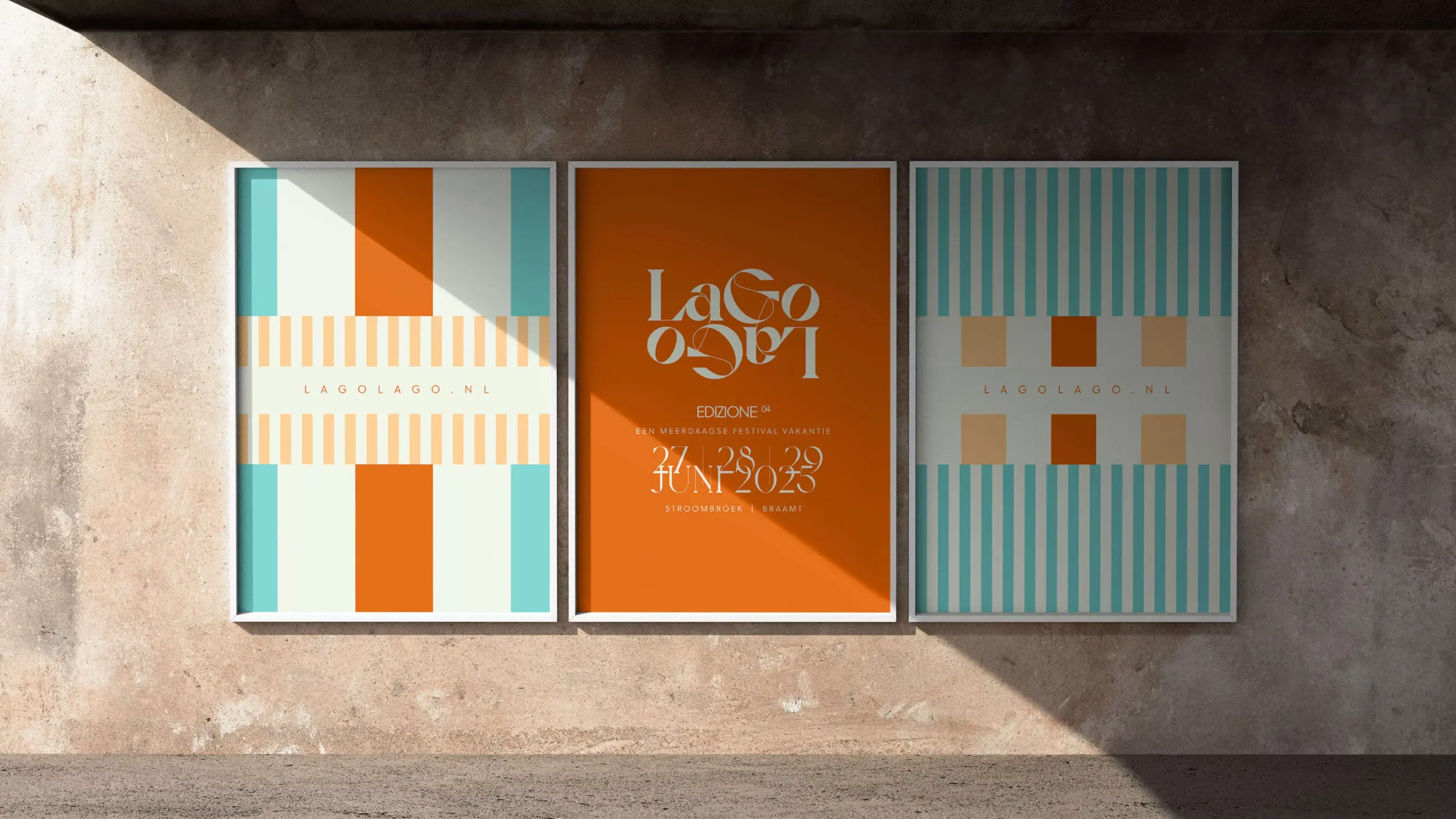
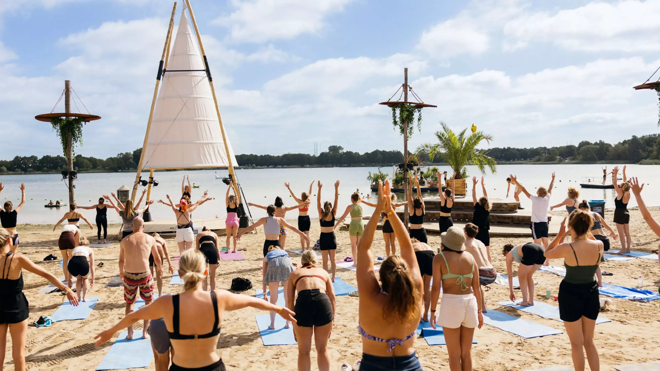
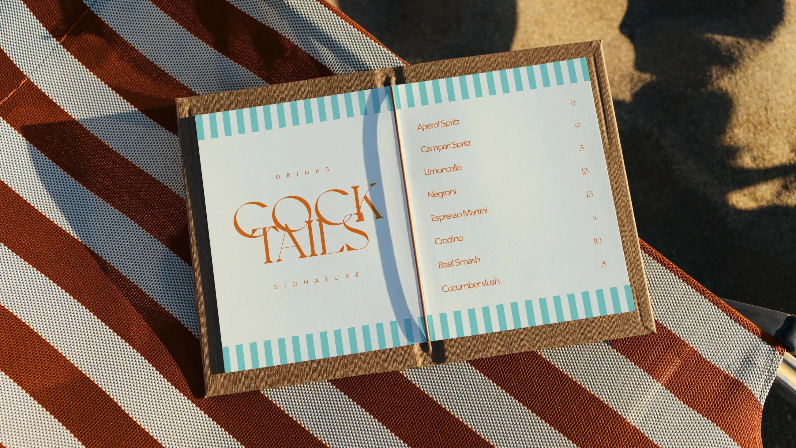
The strategy — Entering the next stage in a multi-year evolution: how to redefine the brand’s essence? Which parts are fixed, which parts are editable? For starters, the logo has become an anchor and a pillar. Besides the logo the mirroring graphics that symbolize a waterline are also hardwired in Lago Lago’s DNA. But the colors change every year. For the fourth edition we made a return to the calmness of an earlier ‘sand’ primary color. And by exploring an informal Italian tone of voice, another defining step was made.
Perfume and gelato
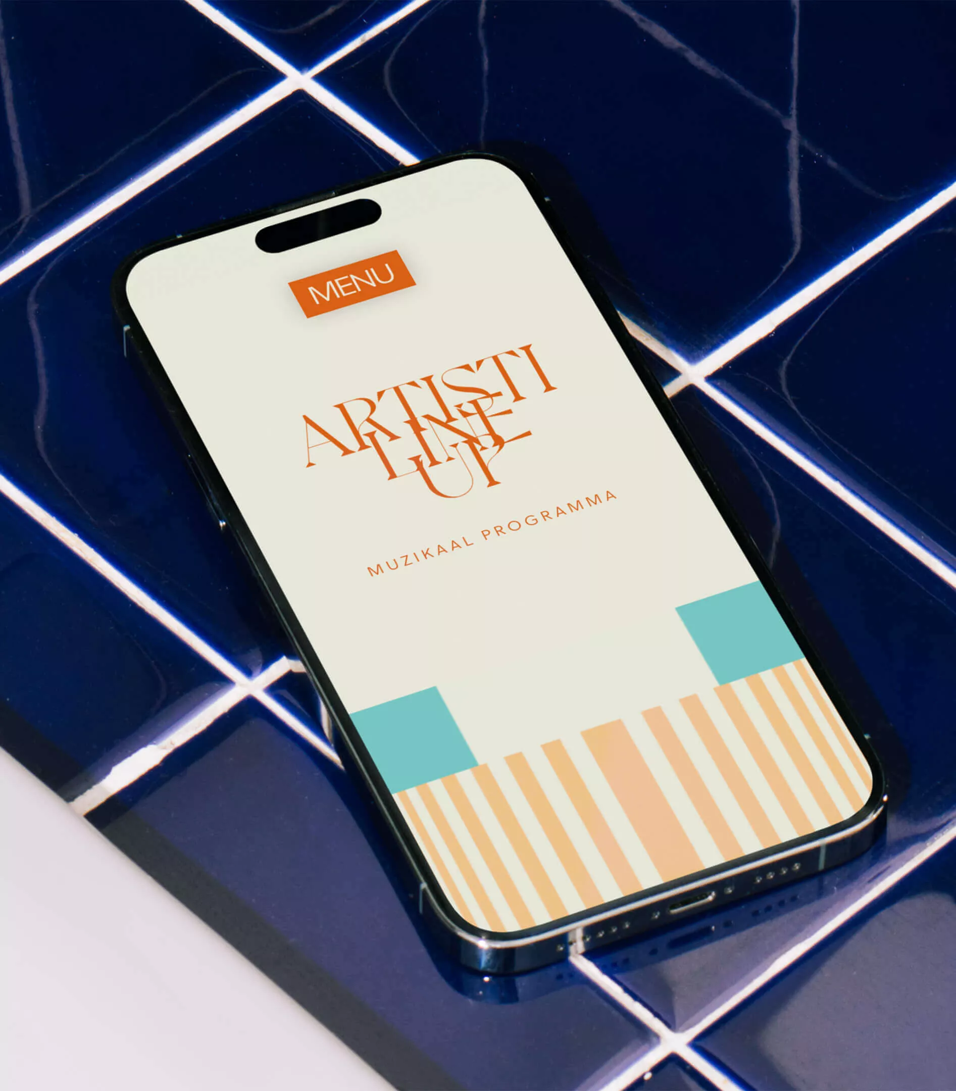
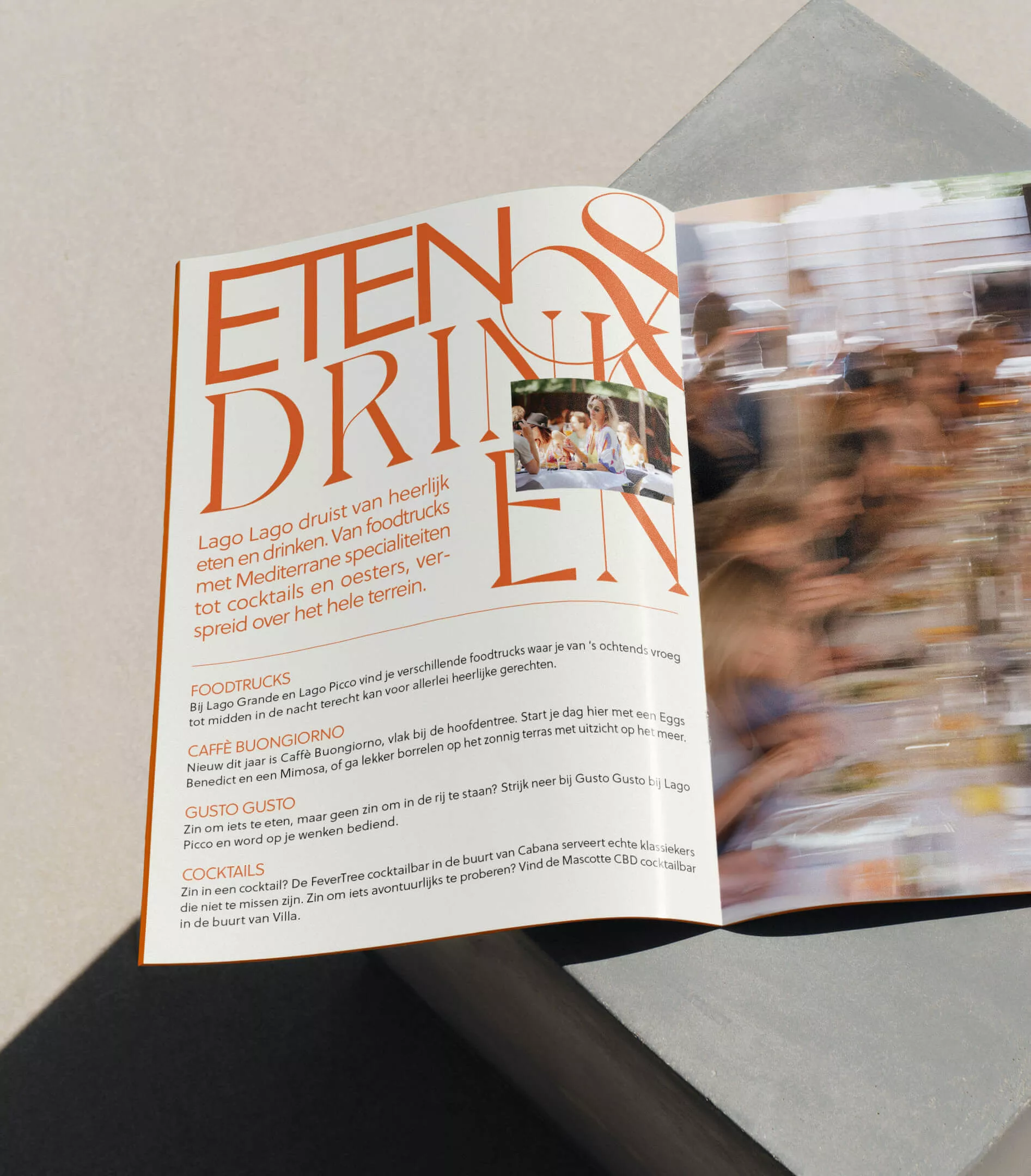
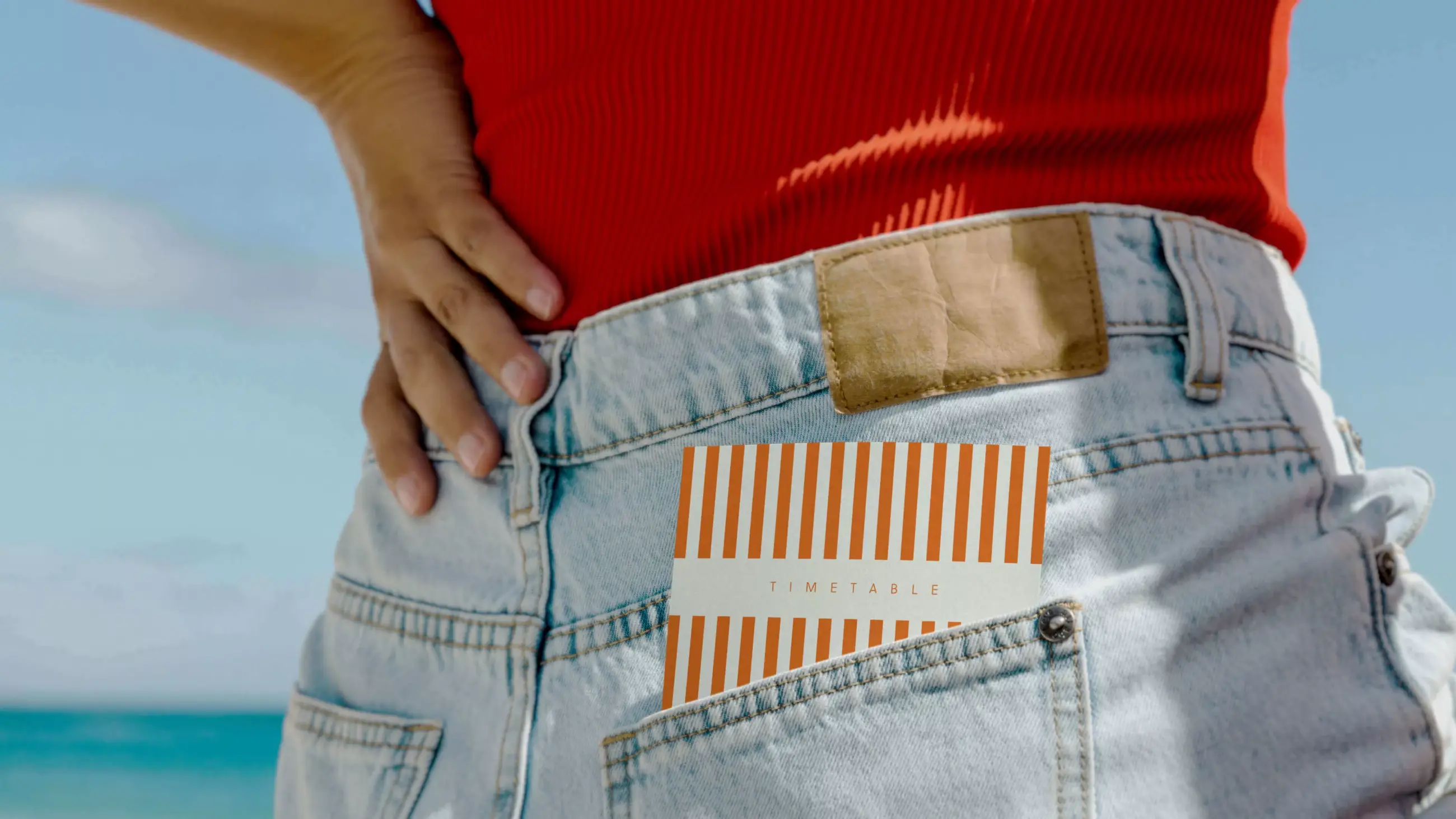
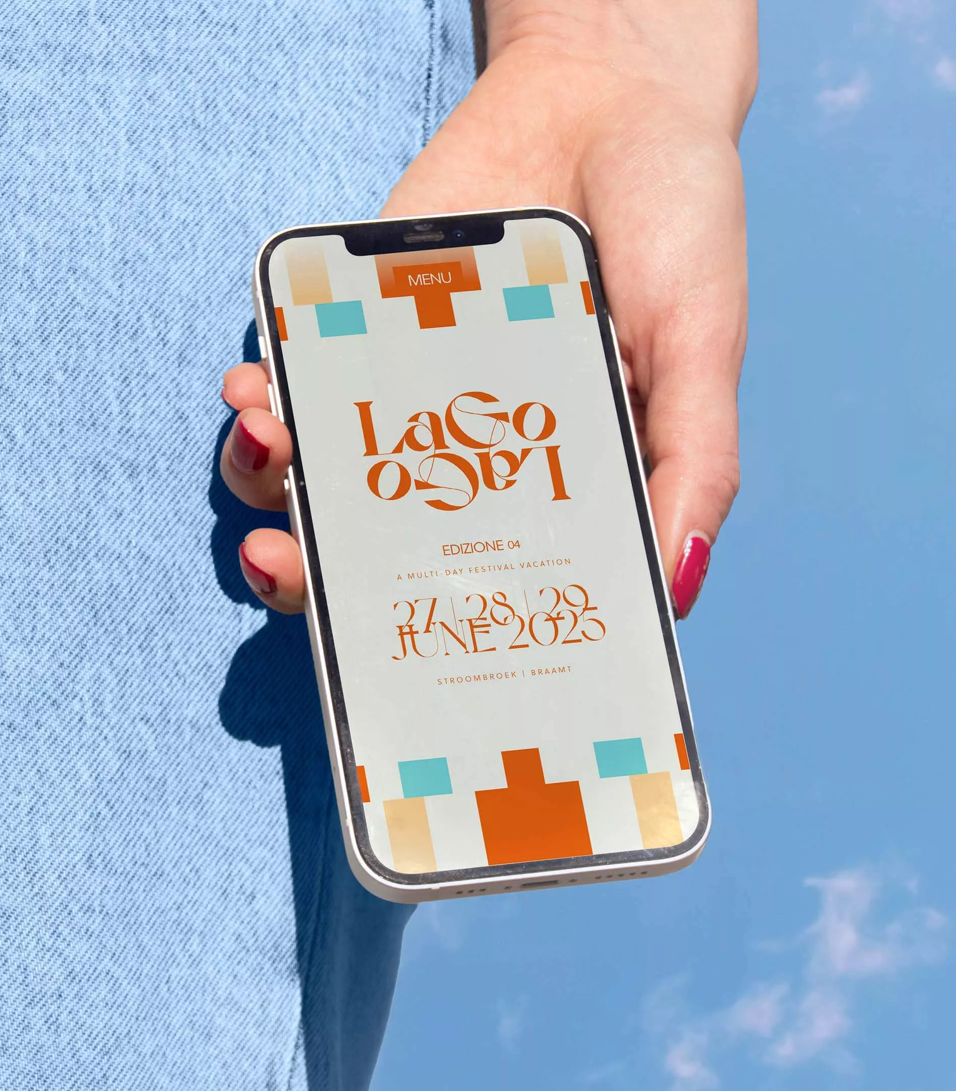
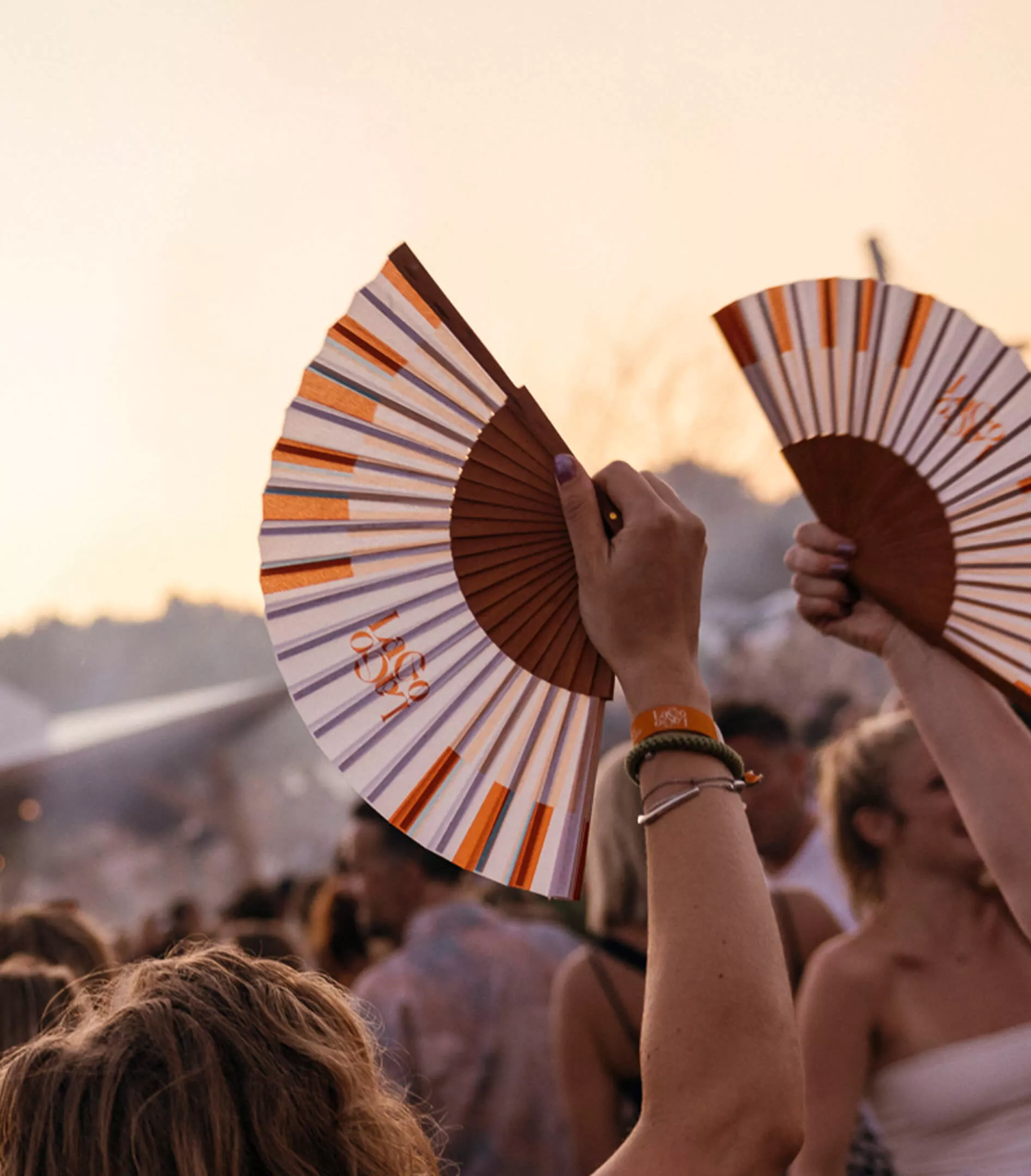
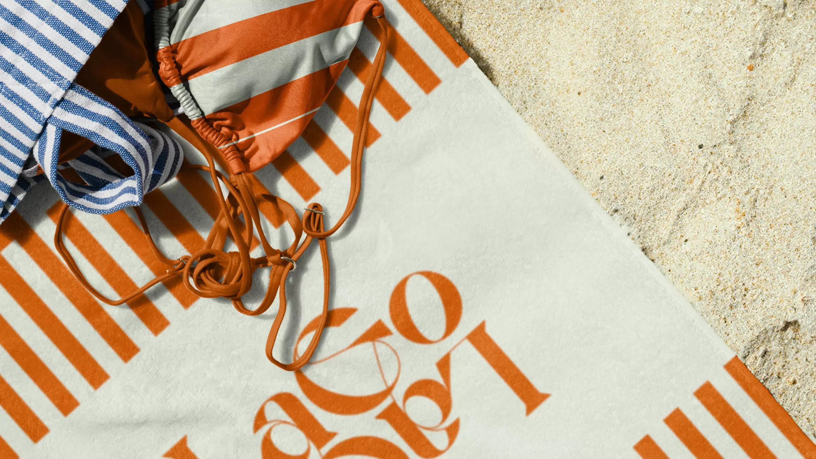
The design — The design focus was Mediterranean summer nostalgia. By balancing retro and modern colors, the design dips in earlier age without drowning in it. Inspiration for the patterns was drawn from Italian beaches from the 50’s—80’s: the parasols, the towels, the beach beds. To achieve a feeling of spaciousness and grandeur, the compositions emulate Art Deco architectural compositions. The typography took elements from both refined perfume bottles and Gelato ice cream parlors.
Photography: Laura Siliquini, Kirsten van Santen and Niels de Vries
Webdevelopment: Liqid Design
Feel persuaded? Get in touch