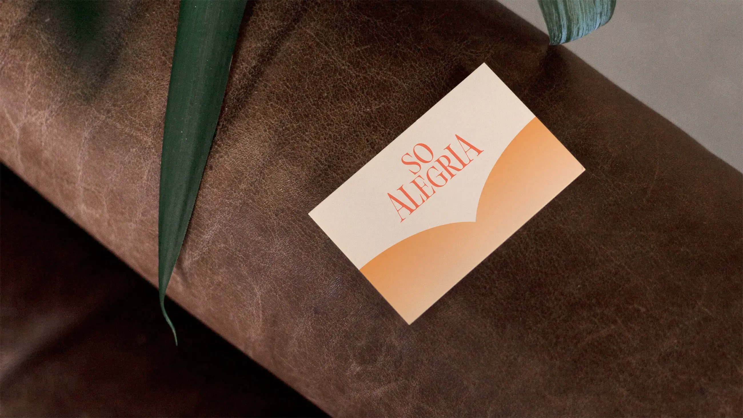
So Alegria
Branding an emotional journey
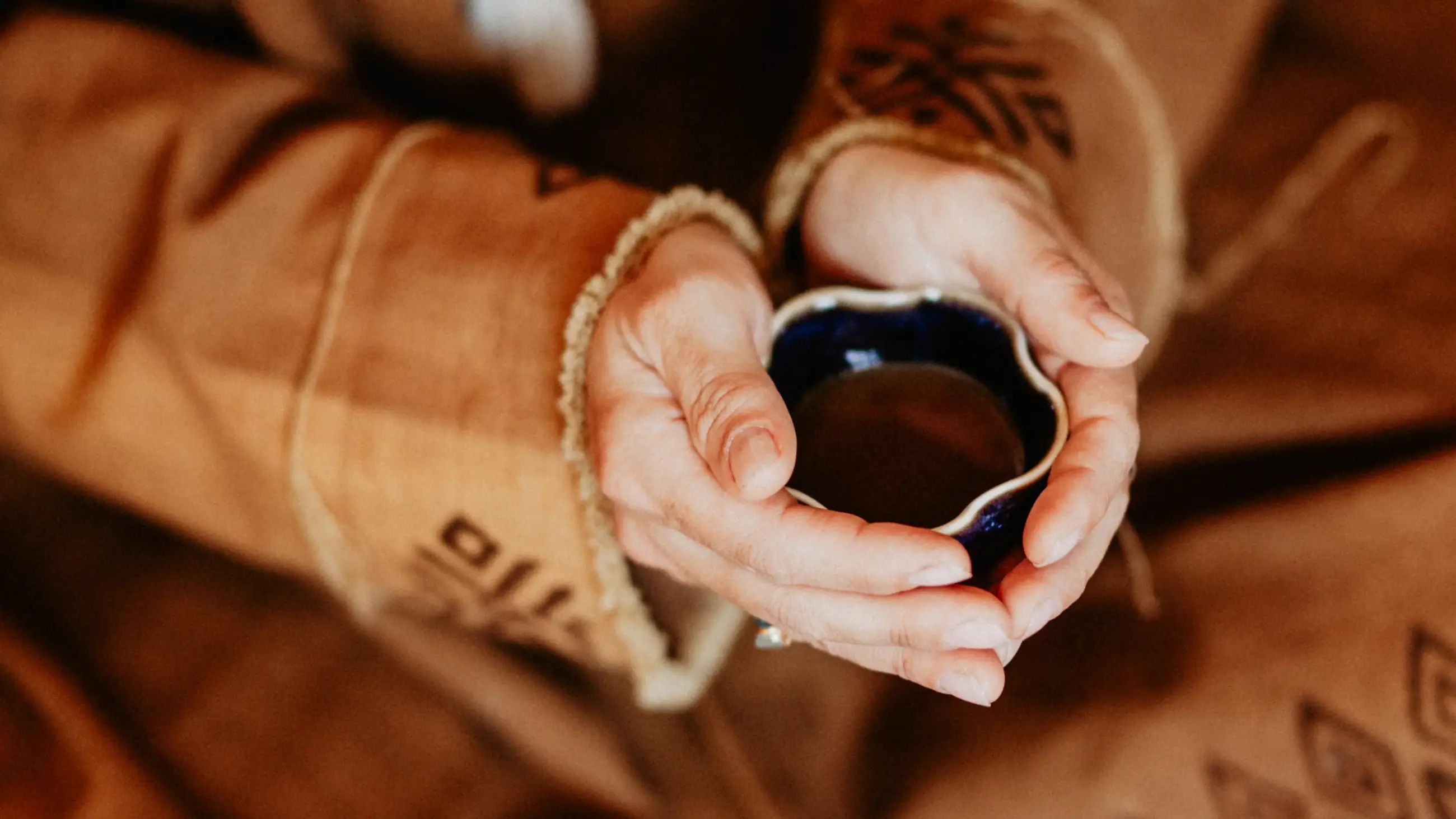
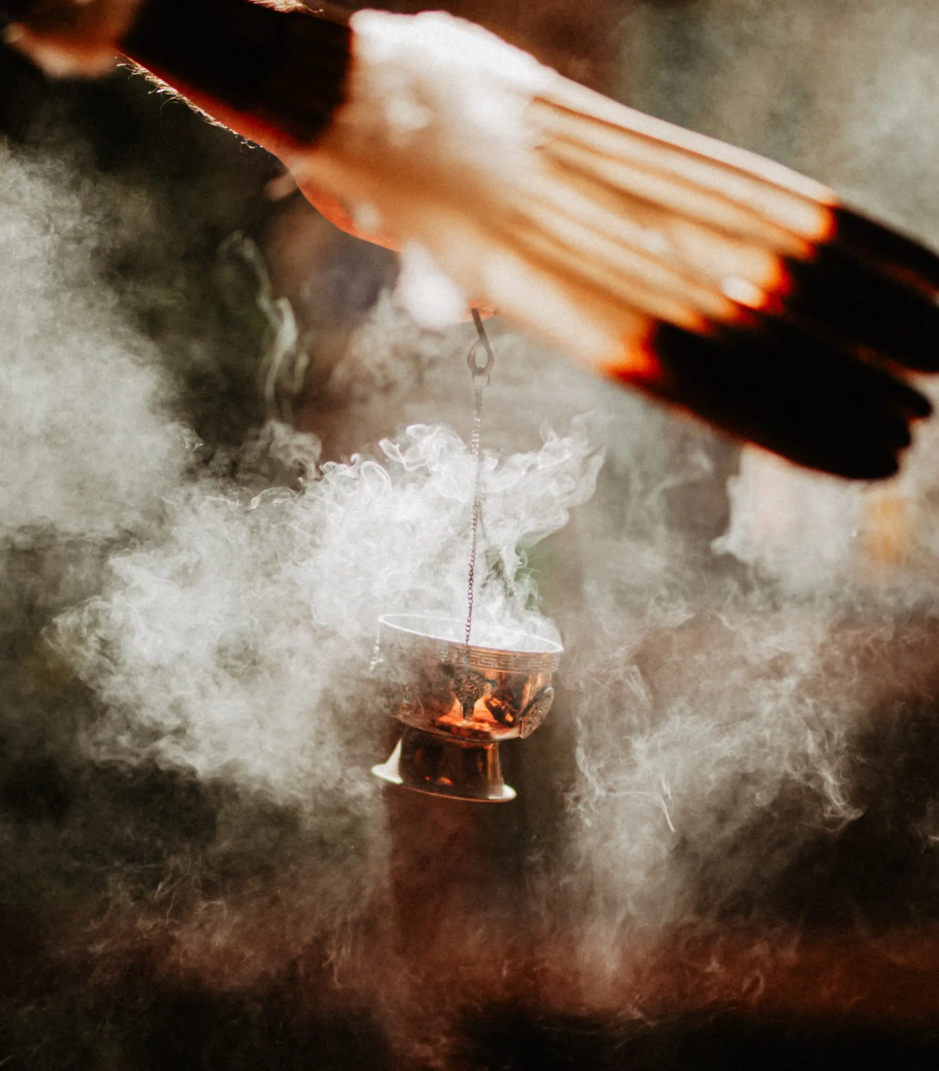
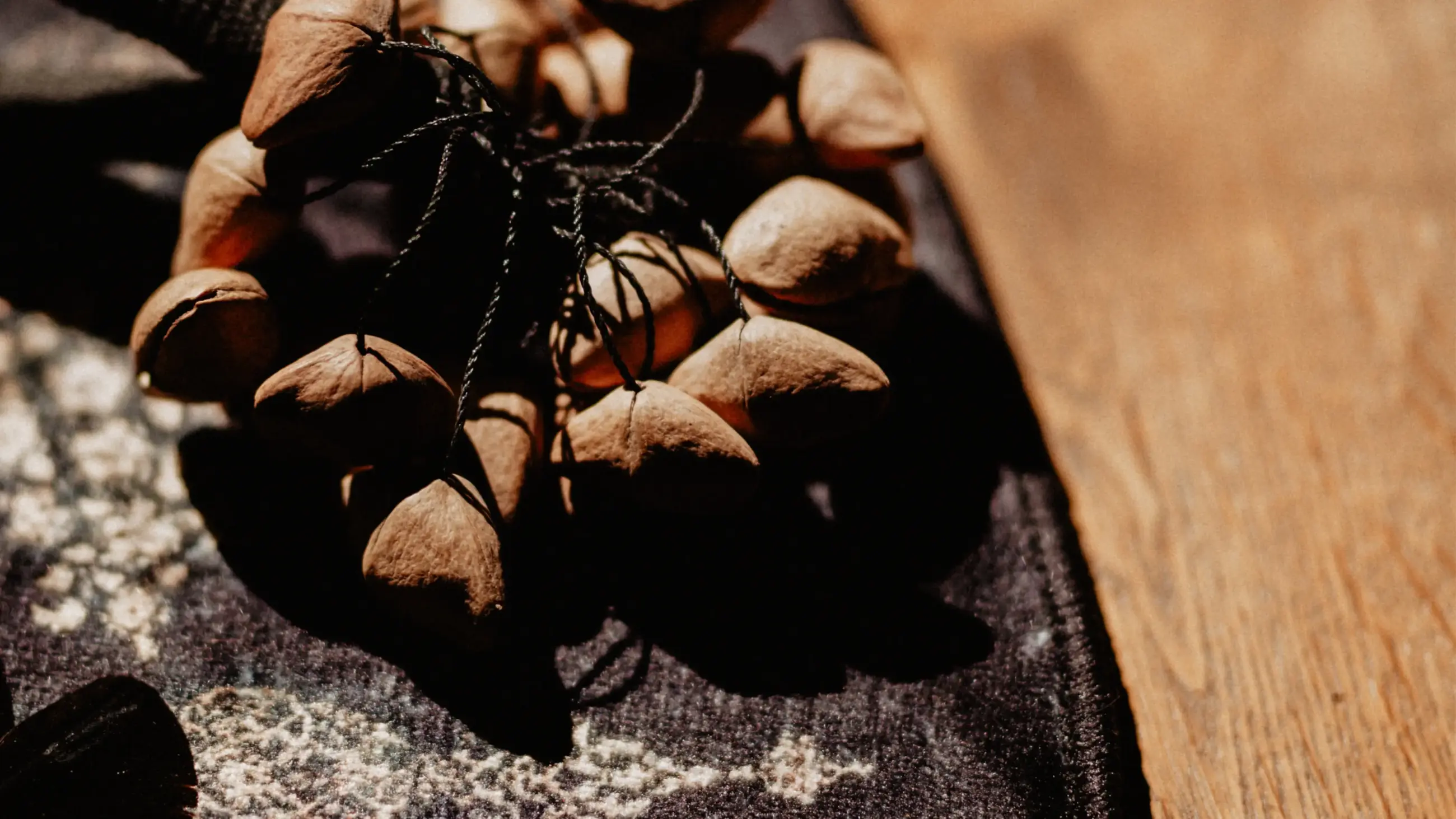
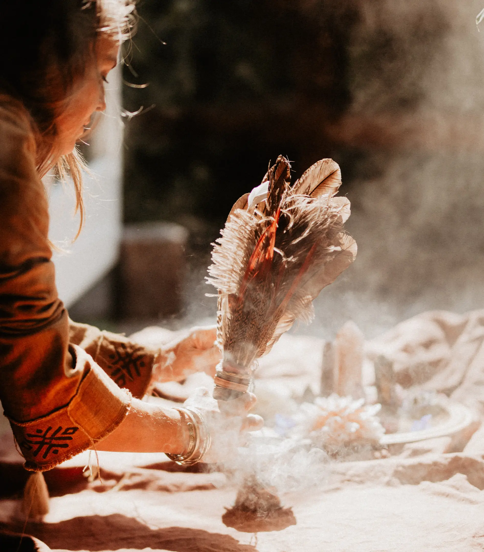
So Alegria means ‘mere joy’. A fitting name for a brand that offers spiritual retreats from here, all the way to the heart of Costa Rica. Rarely have we worked on an identity with such a harmonious and warm sensitivity. Rarely, too, do we get to work with such interesting ingredients: spiritual growth, a Mesoamerican color palette, a poetic narrative, and psychedelic graphics. A designer’s dream. But also,a serious business, that required a deliberate design.
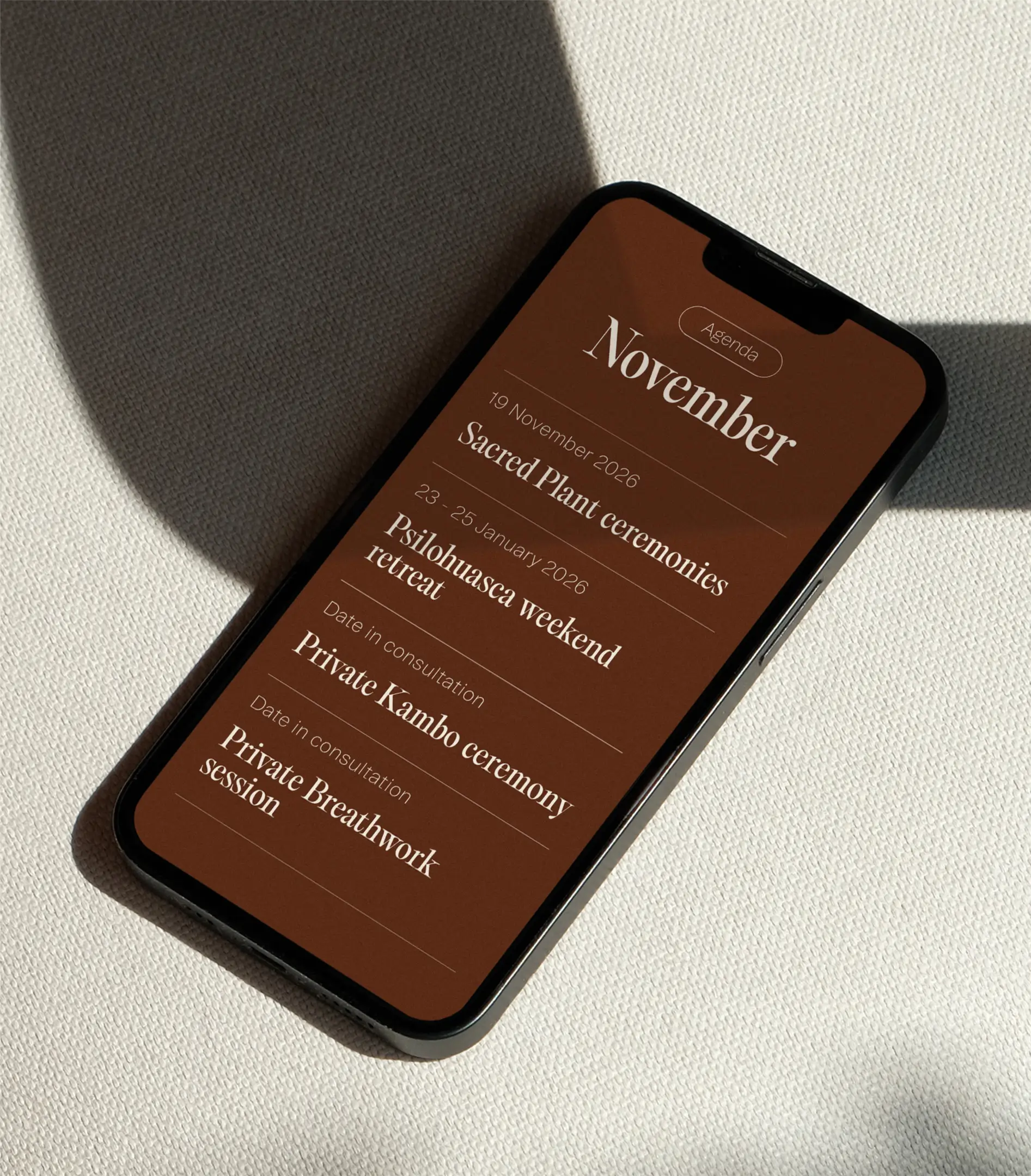
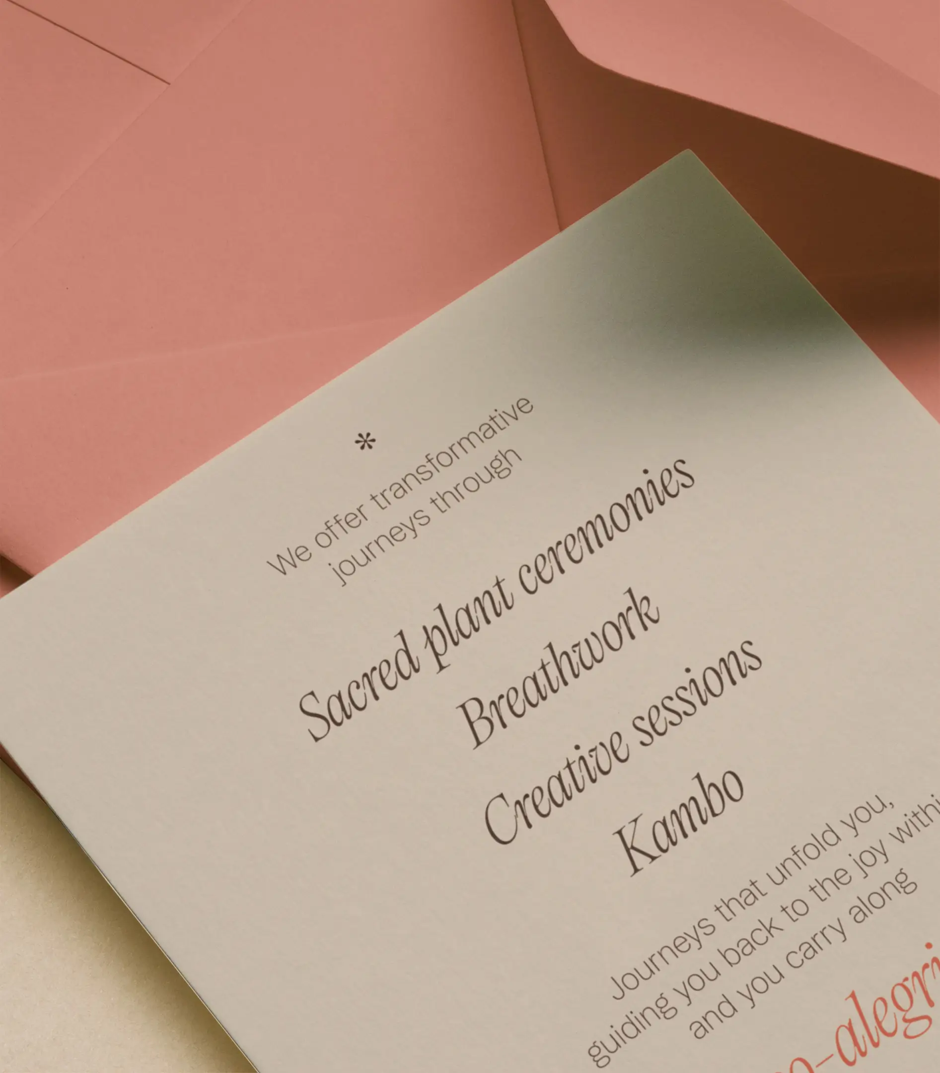
Surpassing the predictable arts-and-crafts look and feel of spirituality commerce was a big criterion from the outset. The goal was to launch So Alegria in a credible way and attract a curious Western audience to their retreats. By capturing the unique feeling of spiritual growth, we were able to convey So Alegria’s message and value as an experienced guide, without having to oversell it. With a range of powerful design elements, So Alegria can now communicate their extensive offering of techniques and rituals.
The value we added
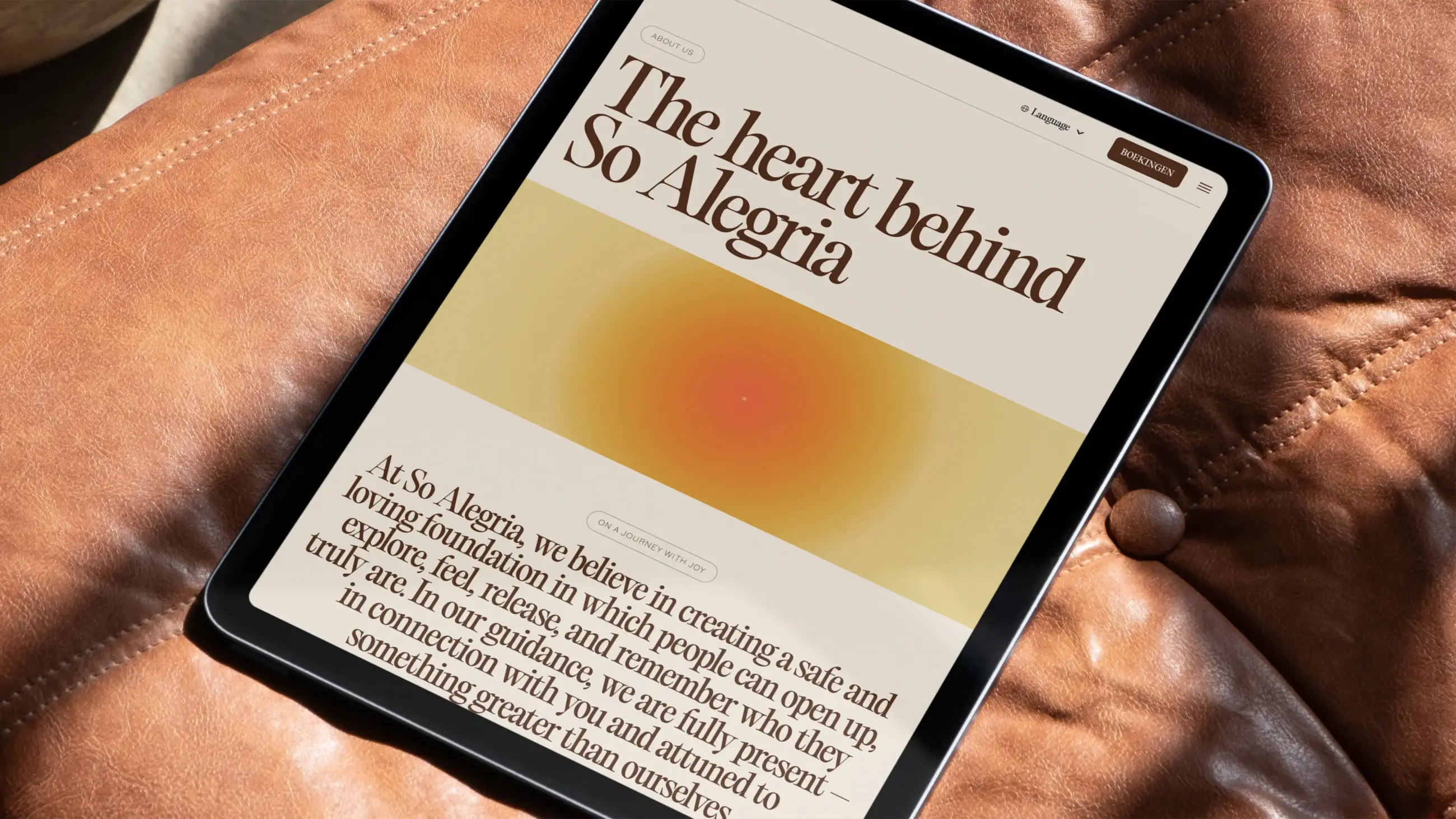
The strategy — Part of the design brief was to tailor the brand’s proposition for a Western audience while remaining in touch with traditional ways and culture. We navigated this challenging by shifting the focus away from traditional techniques, customs, and cultural markers, and toward the emotional essence that defines any spiritual journey. As this is the universally relatable dimension that resonates with Westerners as well.
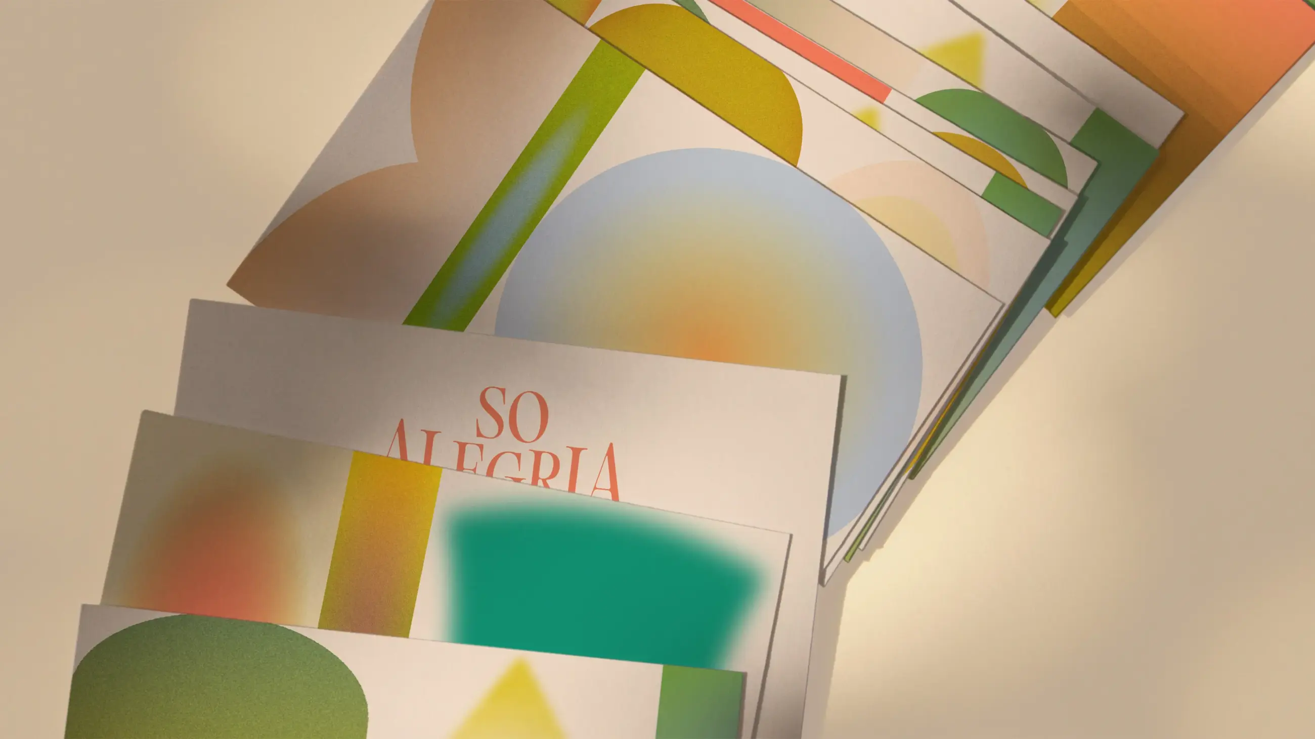
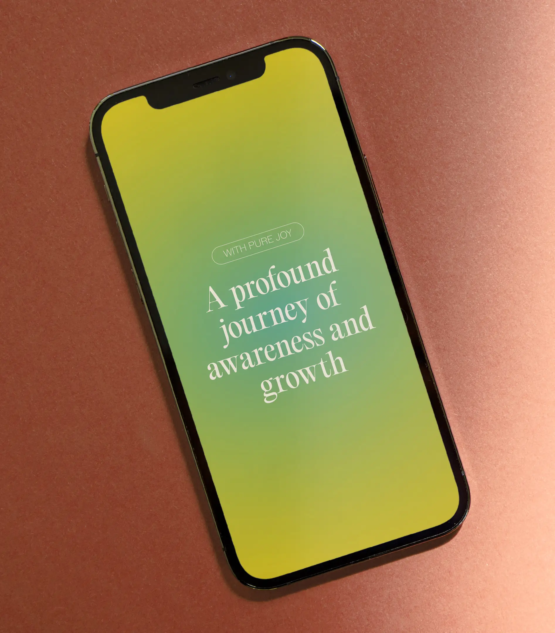
The design — Rooting, entering, and grounding were key concepts describing the type of personal growth So Alegria cultivates. To capture the emotional journey, visualizing feelings as stacked layers became a core design focus. Drawing inspiration from the immersive paintings of Rothko, we developed an emotional aesthetic of colored fields that feels personal while remaining abstract and anonymous. The colors were made vibrant to evoke associations with Mesoamerica. The illustrations and animations are composed along either a downward - grounding – axis, or a forward – traveling – axis.
With pure joy
Working with Studio Kartel was, in one word, fantastic. The final result is not only beautifully designed, but also perfectly aligned with who we are and what we want to communicate.
- Christian Lehota
- Owner of So Alegria
Feel persuaded? Get in touch